Photography by Leslee Mitchell
Jessica Davis, principal designer of JL Design, is a Hendersonville native whose mother and grandmother both worked in Nashville. Like any Middle Tennessee native, she’s just as impressed by the recent boom of Nashville’s neighborhoods and wishes her grandmother was alive to see how much it has changed.
“She would just be blown away,” Davis says.
Most likely her grandmother would especially love a project Davis recently completed in the 12South/Belmont area, a neighborhood Davis loves so much she moved there herself in 2014. The combination of newfound energy and historic architecture drew her in.
“I love blending the old and the new and trying to make everyone happy,” she says. “You will run across clients who are just ready to completely gut and put in all new everything, and that’s great. But you have to be careful you’re still honoring the integrity of the original structure, the era in which that structure was created, and the story that structure may have.
“If a home was built in 1908, who lived here? What was life like? What would they have done? I really love creating that juxtaposition between what’s old and new — forcing those elements together in a way where it’s ultimately harmonious.”
So basically, Nashville in a nutshell right now.
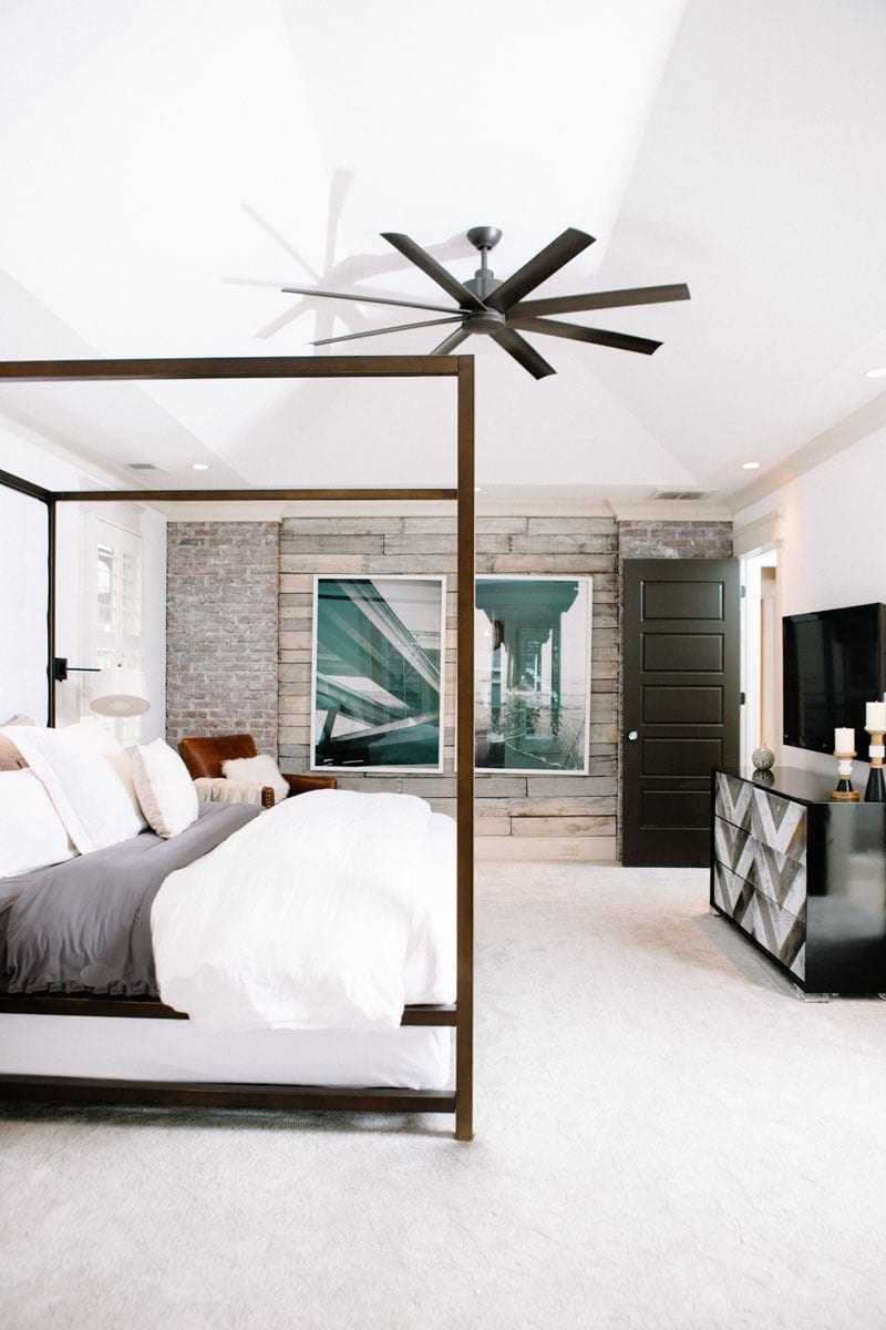
And definitely the plan for a recent client who called for a refresh of his 12South space after a divorce. Davis was able to move out some of the traditional and bring in some vibrant elements that shifted the focus of his home — which had all the right bones — to a new perspective that reflected the person he was now, not where he had been.
“I went through the house and tried to say, ‘Okay, let’s make this feel like your home,’ ” she says. “It was a lot of fun because he had a lot of input. There were some things that he had already done himself that were really cool and interesting. It was trying to balance traditional and contemporary in a historic home.”
Unexpected details
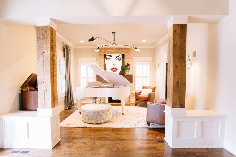
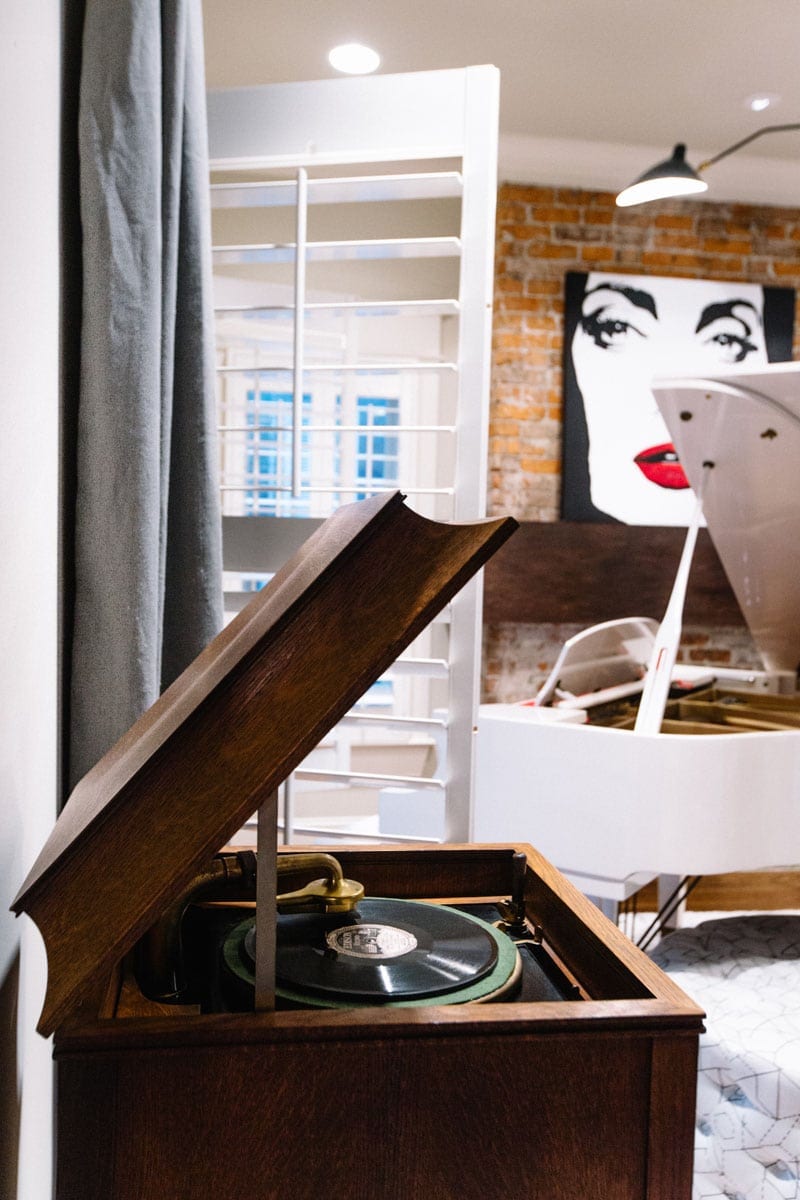
His formal sitting room — complete with traditional leather chairs and dark draperies — was rarely used, so Davis wanted to play on his love for music and turn it into a music room.
“When I talked to him, his love of music and his love of Music City [shone through,]” she says. “He’s not a musician himself, but he works for a lot of musicians. His mother plays the piano, and his father plays the drums.”
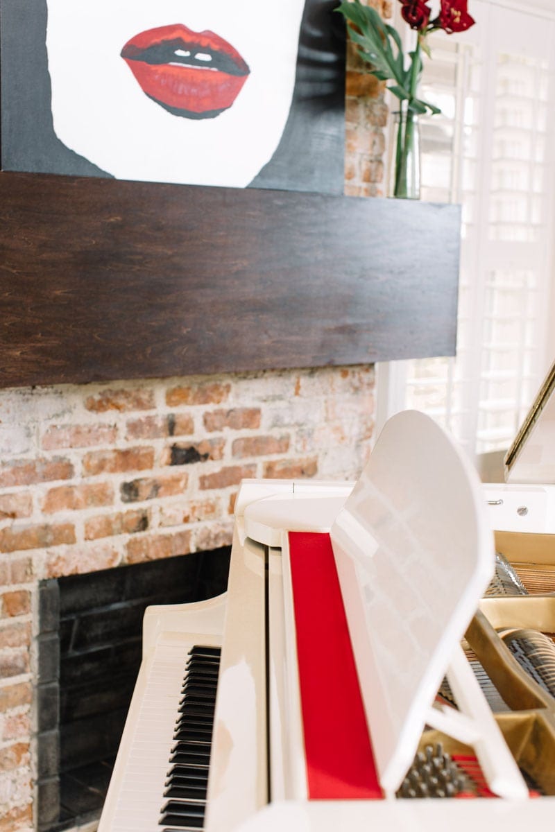
The white piano with red interior in the center of the room is a true showpiece — it was one of those Craigslist scores that keeps people willing to meet strangers in strange places. And while the client was a bit apprehensive about such a bold piece, Davis assured him it was a must-have.
“You never know what you’re going to find with Craigslist,” she says. “It’s unexpected, and it really pops.”
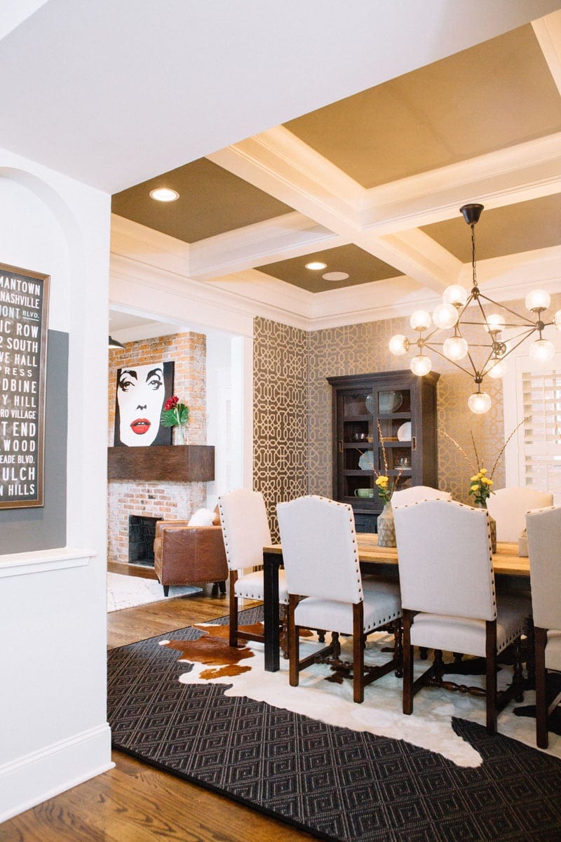
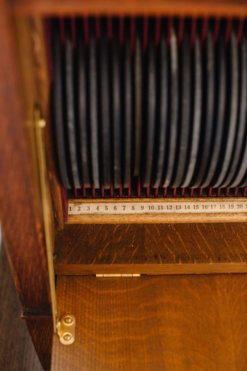
They went to the flea market and scooped up a vintage Victrola, complete with a stack of records, and then Davis had a large-scale pop art piece placed on the mantel, commissioned from artist Jessica Phillips.
The mantel is also something special. It’s oversized, because Davis thought it helped blend the contemporary elements with the historic brick wall, and it’s a major upgrade from the smaller mantel it replaced.
“Again, I wanted to play up the scale,” Davis says. “I said, ‘We have this historic brick, which I love, but we need to break it up a little bit with some of these contemporary modern elements.’ So I really wanted a mantel that wrapped the entire fireplace chimney and around the side.”
The result is large expanse of almost velvety-smooth wood that contrasts beautifully with the textured geometry of the brick. The painting plays on the bright lacquer of the piano, and all of it seems to work with the structural columns in the room that couldn’t be moved.
“It is really just a balance of elements,” she says.
Pushing comfort zones
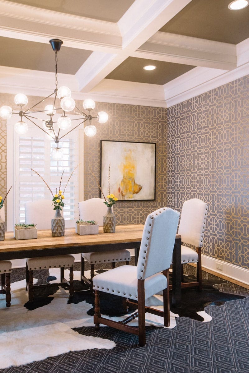
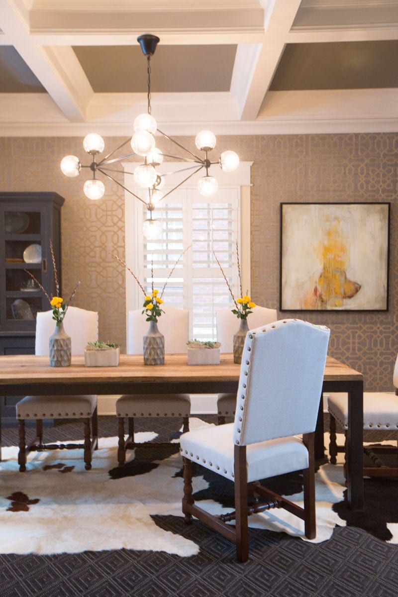
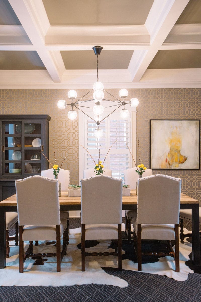
Wallpaper is a growing trend, but it still is out of many homeowners’ comfort zones. Even when someone wants wallpaper, they often waver when they are actually faced with options. That was certainly the case when choosing the paper for that same client’s dining room.
“The first wallpaper that I really pushed for was much more bold and loud,” Davis says. “I wanted to go nuts, but he didn’t quite let me go nuts. But this was a fantastic one because of the texture. It’s a very heavy paper with velvet geometric on top. And I think for him, the tone-on-tone made him a little more comfortable.”
Some of his existing pieces got a coat of paint to make them more modern; the dining room table and hutch were transformed from dark wood to a charcoal-blue mix that made them more cohesive with the space.
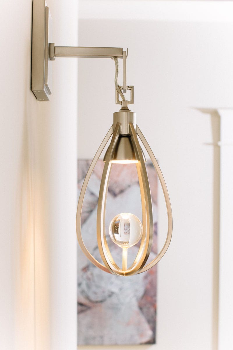
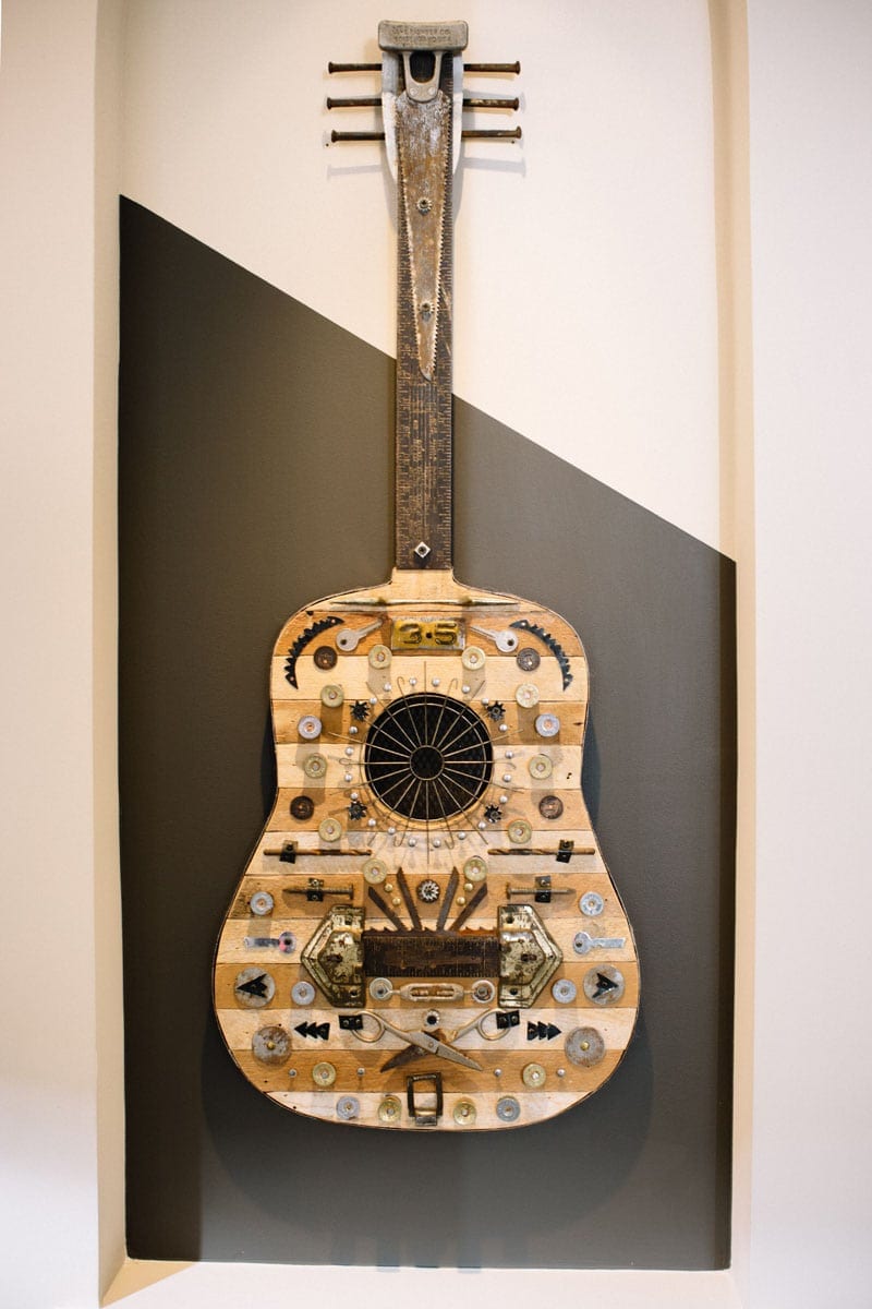
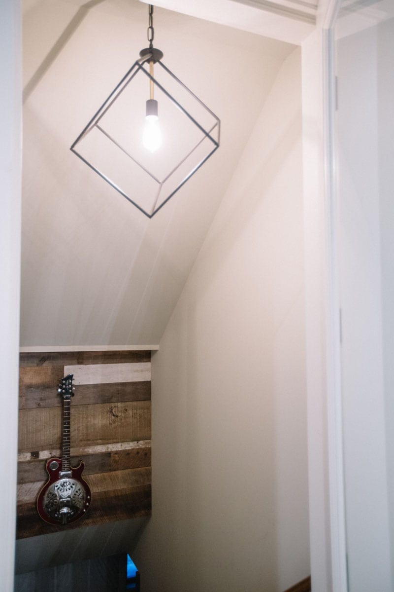
Dated lighting was replaced throughout the house, adding new chandeliers and swapping out sconces. Fixtures and faucets were updated too — changes that seem little but make a big difference. Then, art was brought in, which Davis says is one of the most important elements in any space.
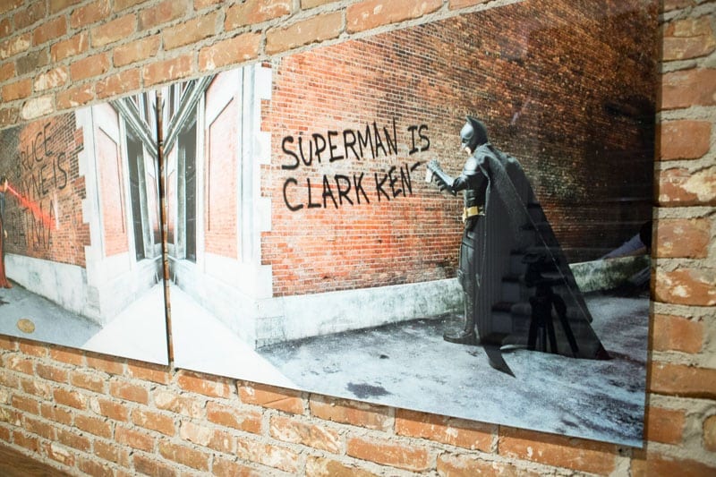
“Art sends a message that tells the story of who people are,” she says. “I want the pieces to tell a story, their own story, but also a story that connects with the homeowner.”
All together, the goal was to create a space that evoked who the homeowner is and how he lives.
And it worked.
“Any project I do, I’m really trying to capture the essence of the clients and their story,” she says. “When I really partner with a client and create a space that I know they are going to love, I spend a lot of time with them trying to uncover the design elements they are drawn to. Is it line, is it texture, is it geometry, is it color relationship? Then I try to achieve that, where they not only feel comfortable in their space, but leave each room with a feeling.”









Leave A Comment
You must be logged in to post a comment.