 By Hollie Deese
Photography by Justin March
Photography assist by Cooper Alan
The luckiest designers are the ones who have a career illustrious enough that they can do multiple projects for the same client throughout their life, building on an established relationship while ushering them into each new stage of life as the years go by.
A client like that is why New York-based designer Vicente Wolf was in Nashville recently, working on the redesign of a Green Hills home he worked on for the first time 30 years ago — after the homeowner saw his work in a magazine.
In the time that passed between projects, the homeowner had acquired plenty of new pieces. But Wolf was able to reuse many of the ones he’d worked with before, giving them new life and purpose in the space.
“I find it amusing to take things and rework them,” Wolf says. “It’s a fun challenge to see it differently. And in the beginning, she loved it. It was beautiful the way it was before. But then she said, ‘Why don’t we just refresh it?’”
Wolf was excited with the challenge of reworking a space he had designed to make it new for the residents. “I thought, if you eat the same thing every day, it gets a little boring,” Wolf says.
Wolf is known for his clear, restrained and elegant aesthetic, inspired by his many travels that brought global perspective to his designs. This is clear in the Green Hills project, which incorporates authentic, globally sourced artifacts from the homeowner’s own travels and furnishings with modern décor.
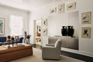
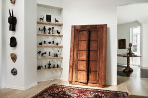
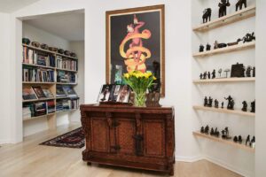
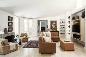
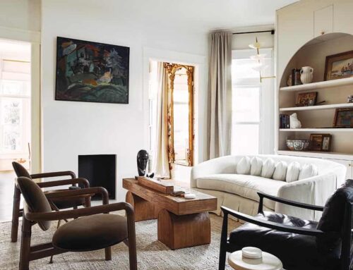
In the living room, it is the owner’s collection of objects that inspired Wolf’s design, the juxtaposition of African pieces with Japanese, an older English chair paired with a contemporary table, midcentury pieces with a Venetian mirror and Japanese chest.
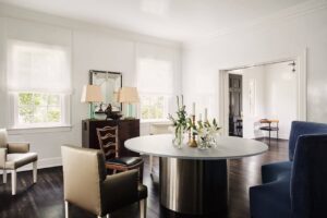
“It gives great depth to the space because it’s not one point of thinking,” Wolf says. “It has a very broad vision and understanding of objects. The tabletop is made out of resin, which is great because, with the light, it’s almost like ice that you’re looking at.”
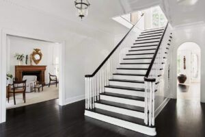
Wolf used finishes to play with light in other ways. He had all the ceilings and walls lacquered, which Wolf says, if done correctly, is a wonderful way to bring in light from the outside, expand the height of the ceiling and give a different dimension to the space.
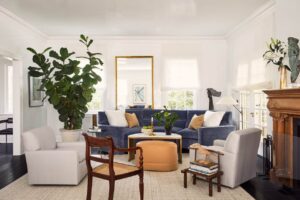
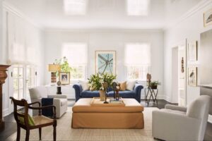
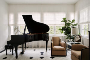
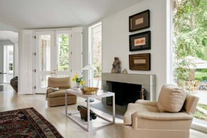
“I think that the beauty of this room, which struck me from the first time that I was here, is the perfect symmetry,” Wolf says of the front room, with large windows facing each other off the front and back yards, allowing light to flow and the outdoors to come in. Wolf accentuates that with the addition of greenery inside, including a tree in a rolling pot so its position can be adjusted as needed.
“For a long time I didn’t use trees and florals. And I’m doing it more now because I think it’s something that brings humanity into the space,” he says. “It ties you to nature. It doesn’t isolate you from what’s alive.”
The first time Wolf designed this room, he used the large fireplace in the middle to create a more symmetrical design. When it was time to redo the space, he knew he wanted a much less structured, less formal look. He repurposed the existing furniture into a new configuration that allowed for the addition of some new pieces.
“I think when you do an off-balance room, it creates a much more relaxed quality to the space. It eliminates the rigidity of it,” Wolf says. “There is still balance — two chairs on each side, a pair of chairs matching on the other end. But you get the sense of a much more casual quality to it.”
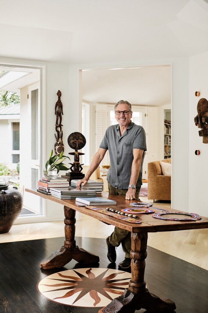
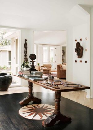
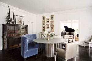
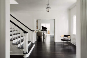
Heading toward the kitchen to the back of the house, an addition he oversaw the first time they worked together creates more flow to the two-and-a-half acres outside. A large table in the middle of it all, along with the dramatic arches and transition to a darker floor, make a big impact.
“The reason for doing that is to really give a center to the space instead of having one big open room,” he says. “The table visually leads you to the outside when they’re entertaining, or it can be a bar to set up food. And it unites all the spaces together, including the den leading to the kitchen.”
He also kept things interesting by combining rounded and square shapes, a departure for many people who want to keep everything straight and even. He also encouraged the owner to display their collections in offbeat ways, like mixing her collection of African masks with piles of bracelets from India.
“We place the furniture, but then we go through all the objects to figure out how to reuse them and where to place them, and that was a lot of fun,” he says.
Wolf says that working in this space a second time pushed him to see things that he didn’t see the last time, or that he simply sees differently coming back to them after decades of designing. “You see different things as your eye progresses,” he says. “Sort of like shuffling a deck of cards: You’re trying to see things that you know in a totally different way.”
Vicente Wolf Green Hills Home Photo Gallery
Click any image to view the full size photo gallery.



Leave A Comment
You must be logged in to post a comment.