New build reflects neighborhood’s past
Photography by Gieves Anderson
When the three partners of Wagon Wheel Title and Escrow decided to build a new office next door to their East Nashville bungalow, they wanted it to look like it belonged there — a commercial project that fit right in with its residential neighbors.
And Angie Lawless, Brandon Miller and Steven Morris knew just who to turn to — architect David Baird with Building Ideas, with interior design done by his wife, Marcelle Guilbeau. Baird had worked on the business’s bungalow a decade ago and has since worked on the trio’s private homes.
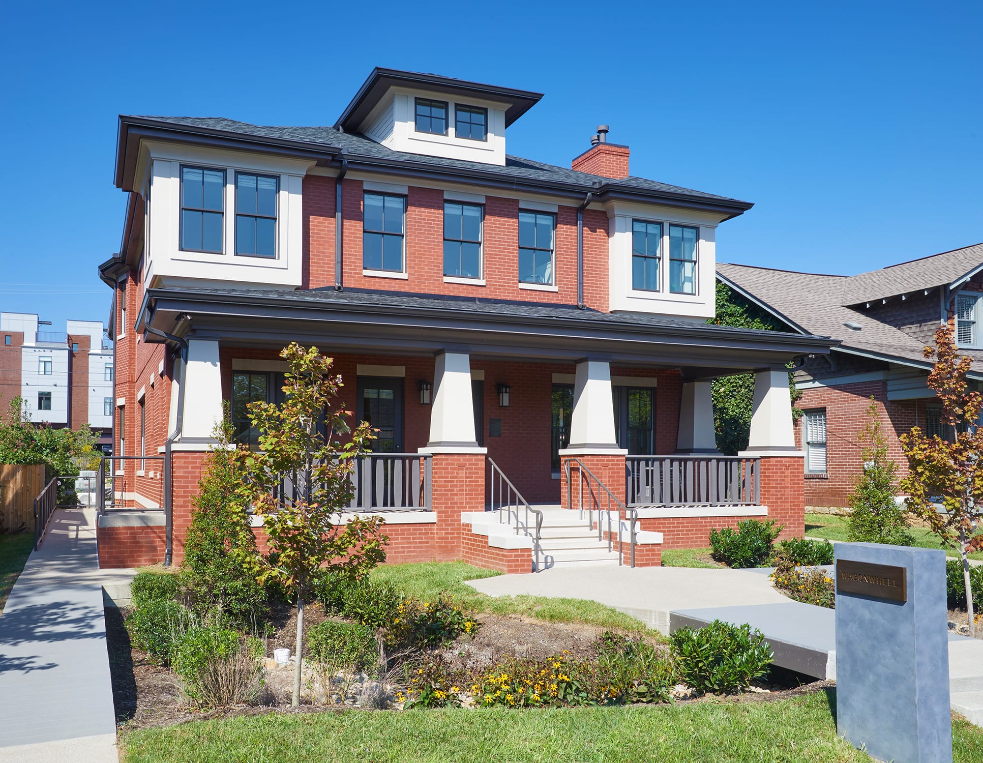
“They wanted the new building to have some patina to it,” Baird says. “When we were looking at types of architecture, exterior finishes, windowsills and scale and all that, we really only looked at East Nashville. We could have looked elsewhere. But, we really, really only wanted to concentrate on East Nashville.”
The result is an urban infill project near Five Points, new construction that creates a sense of place and community while maintaining the identity of the neighborhood.
“We’ve got a very active neighborhood over here,” Lawless says. “We’ve been here for 12 years. We love East Nashville, we’ve invested in it, and we wanted it to be something that people were proud of rather than saying, “Oh my gosh, they just put up a huge building.”
Luckily, to achieve the area’s look and to maximize space for offices and common areas, a box happened to be the perfect shape. Baird used a series of tall four-square homes across the street as design models, and they created a Pinterest board filled with Frank Lloyd Wright projects.
Materials were important, and together they must have looked at more than 60 samples of brick to find just the right orange-red blend. Miller jokes it was more like 300.
“We spent a lot of time driving the streets of East Nashville trying to find brick and mortar that was used in the early ’20s,” Baird says. “We found a lot of examples of the type of red brick, the texture of it, which is fairly smooth, together with a colored mortar that matches the color of the brick. If you look at a lot of historic houses in Nashville, the mortar matches the color of the brick. It makes the houses and buildings look a little monolithic.”
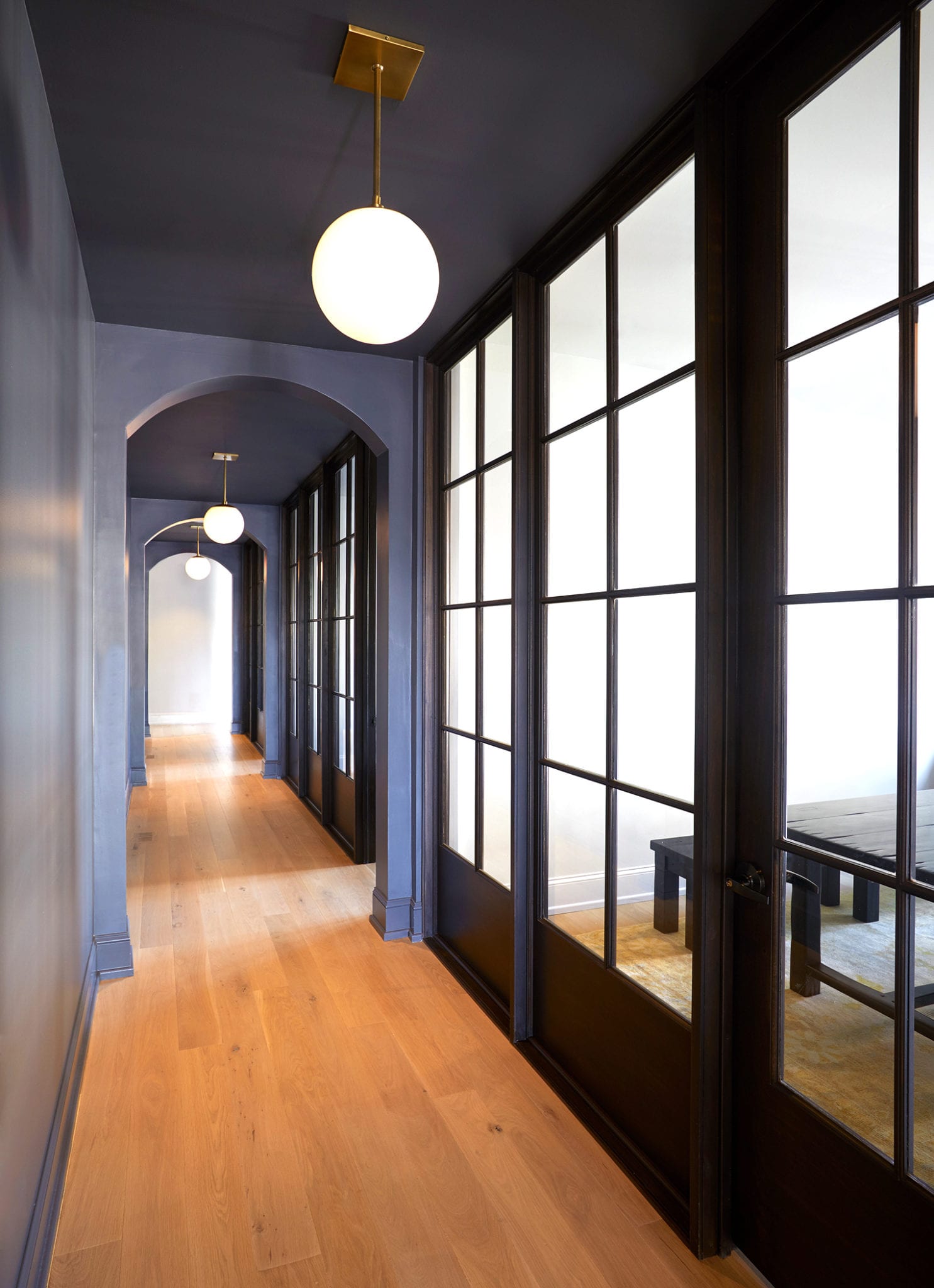
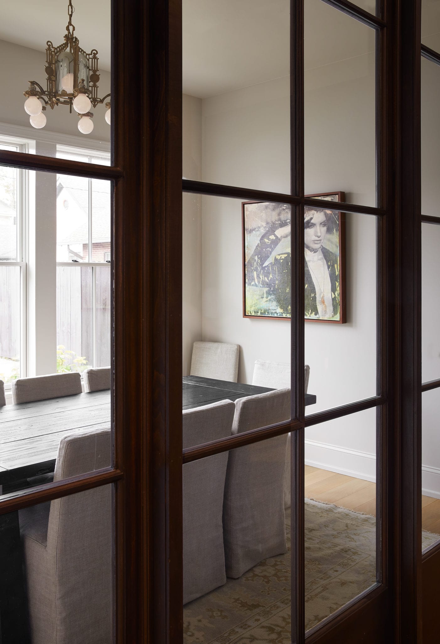
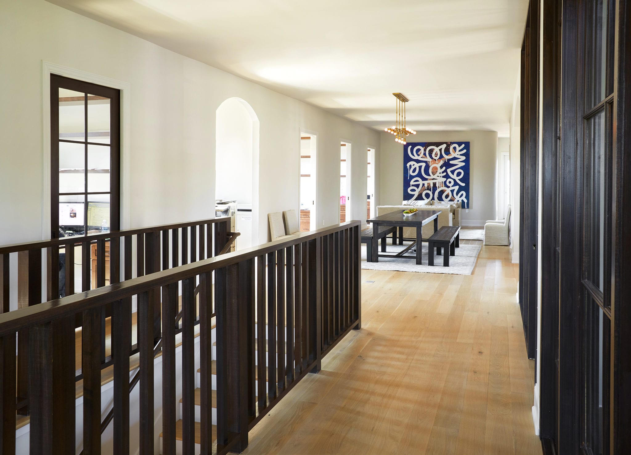
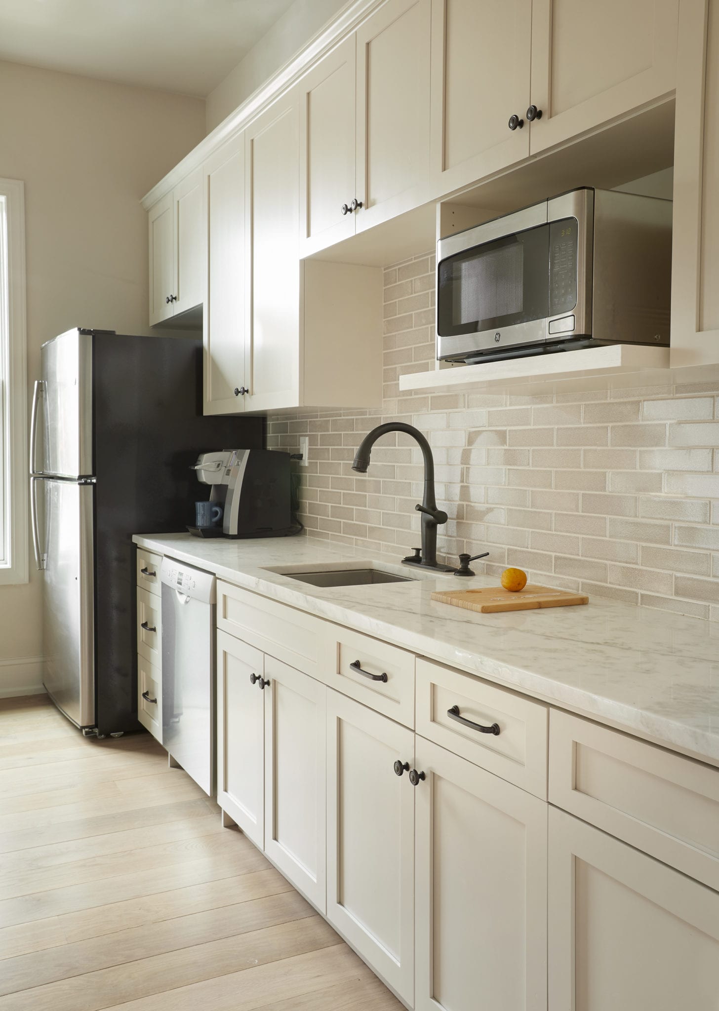
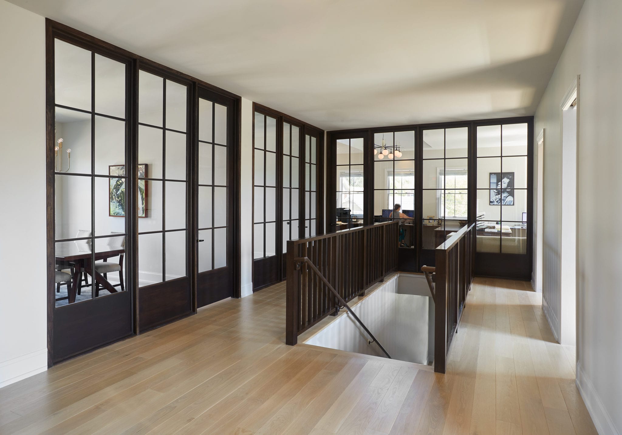
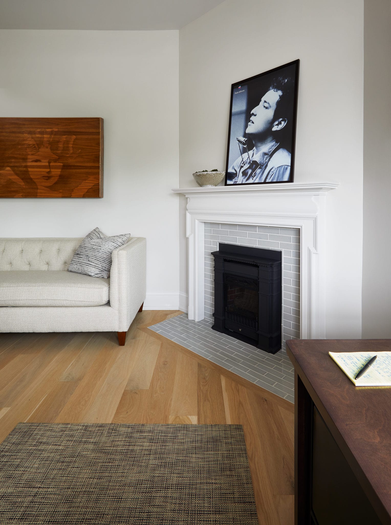
Inside the 6,000-square-foot office, things are more contemporary, but still retain a nod to tradition. After perusing more than 30 wood samples, they settled on a floor by Josh Hitson of Hitson & Co. with a custom width, finish and edge. For contrast, they chose window frames in all the conference rooms and offices in black steel and glass.
And while it is all business upstairs with offices and social zones, downstairs is more of a relaxing environment with exciting art and places to relax. The trendy touch of walls that are rounded off where they meet the ceiling softens the space even more.
“We do real estate closings, and that can be a really stressful thing for a lot of people,” Miller says. “The goal is to create an interior environment that is very calming, that just makes you feel like you’re going into a home and not a strip mall office building.”
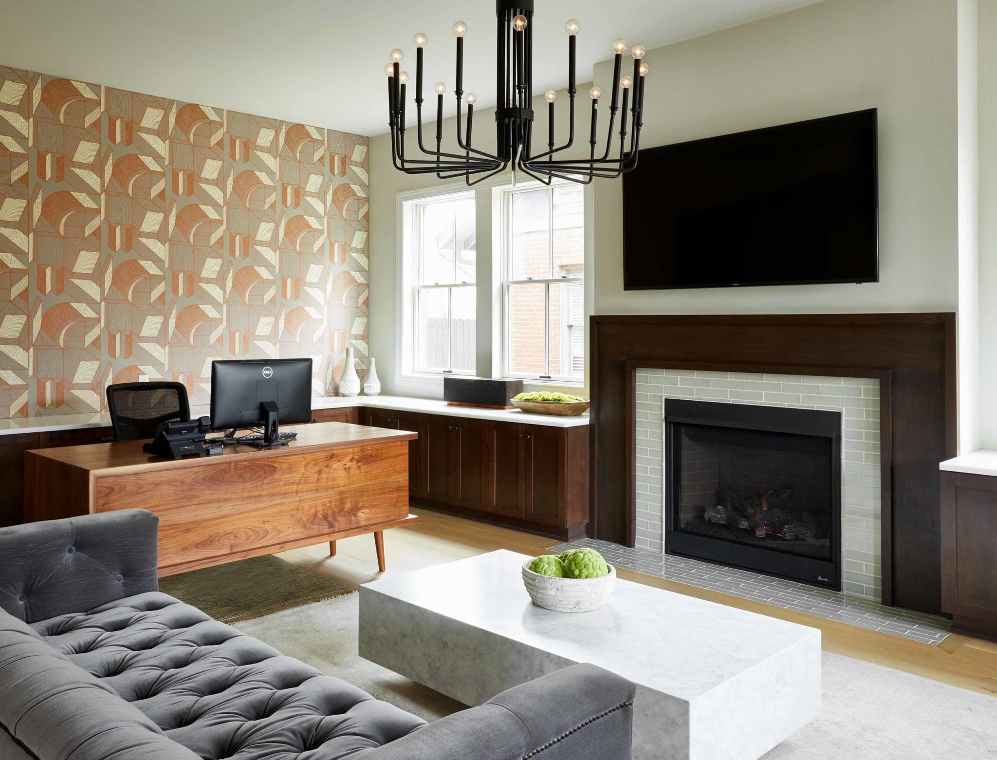
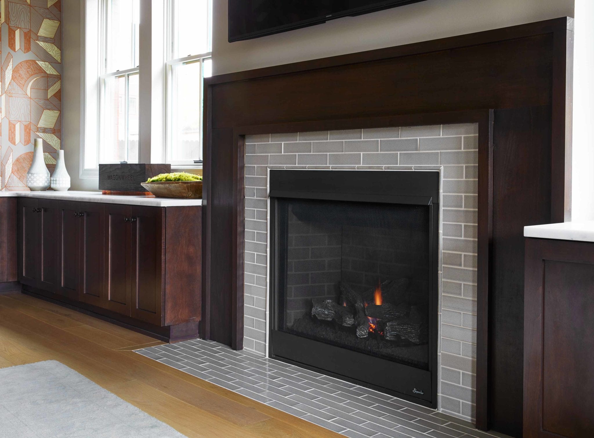
The lounge behind the lobby has a homey vibe, inspired by luxury hospitality spaces like Rolf and Daughters, and is a comfortable place to chill and hang out for a little bit, with graphic wallpaper from local designers New Hat.
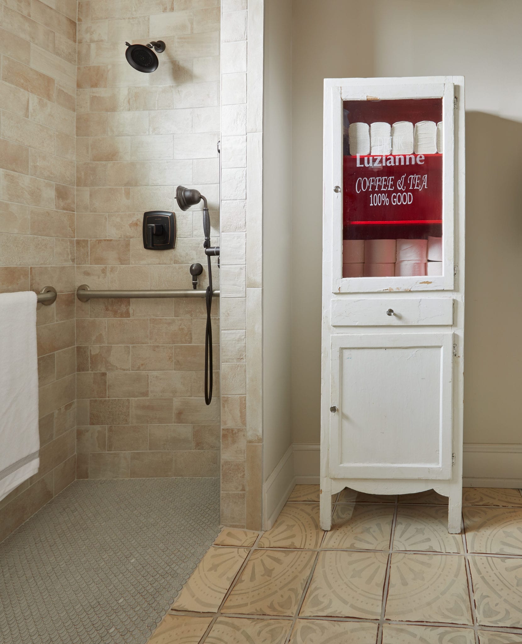
“What they wanted in terms of an overall look and feel was residential luxury,” Guilbeau says. “This goes back to their days in the smaller bungalow before. They love vintage and historic, but at the same time they were bringing in more and more clients from out of town.”
The result is everything they wanted and more and reflects their love for the neighborhood they will continue to grow in.
“That’s very much their heart and soul, is that they are really an East Nashville business,” Guilbeau says.


Leave A Comment
You must be logged in to post a comment.