A Green Hills home is renovated to grow with a family
By Hollie Deese
Photography by Allison Elefante
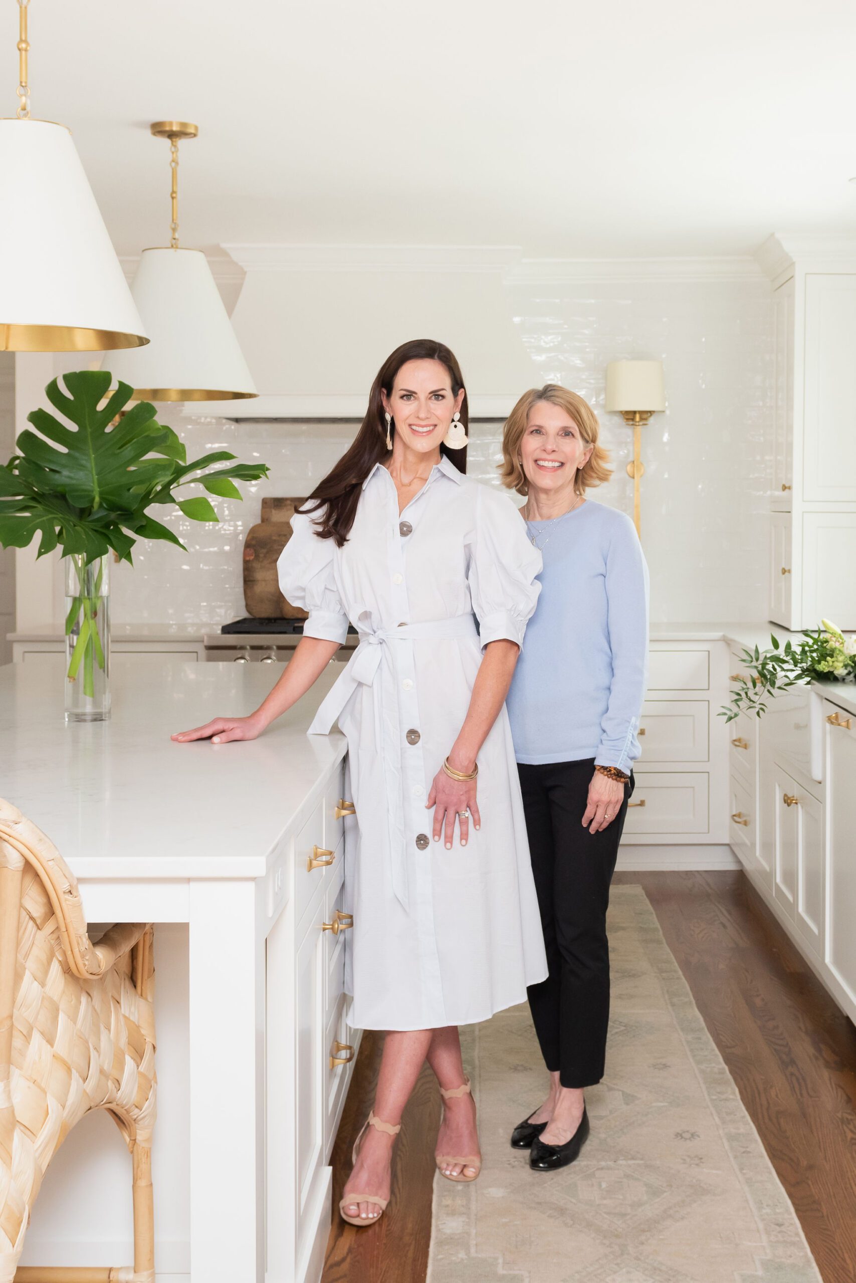
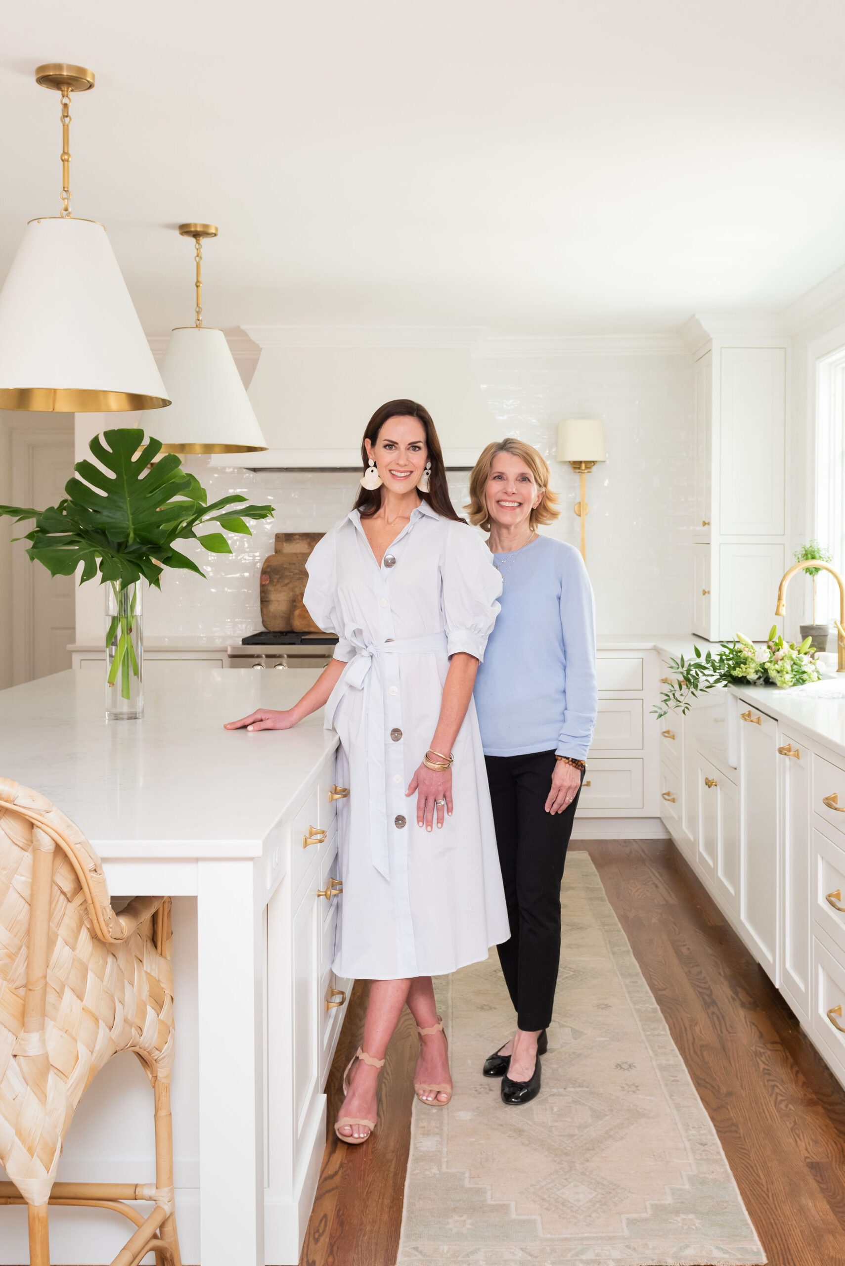
When Leigh Hillenmeyer and her husband, Morgan, moved into their Green Hills home in 2012, she was pregnant with their son, Parks, and their daughter, Reiling, was 3. Drawn to the traditional feel of the house, they saw a home set far back from the street, a back yard great for kids to run around and large bedrooms their children could grow into.
“We thought, we could be here for a really long time,” she says. “And we loved the bones of the house. We knew one day we would renovate, but we thought this was a well-built house that we could see ourselves living in forever. It had this charm.”
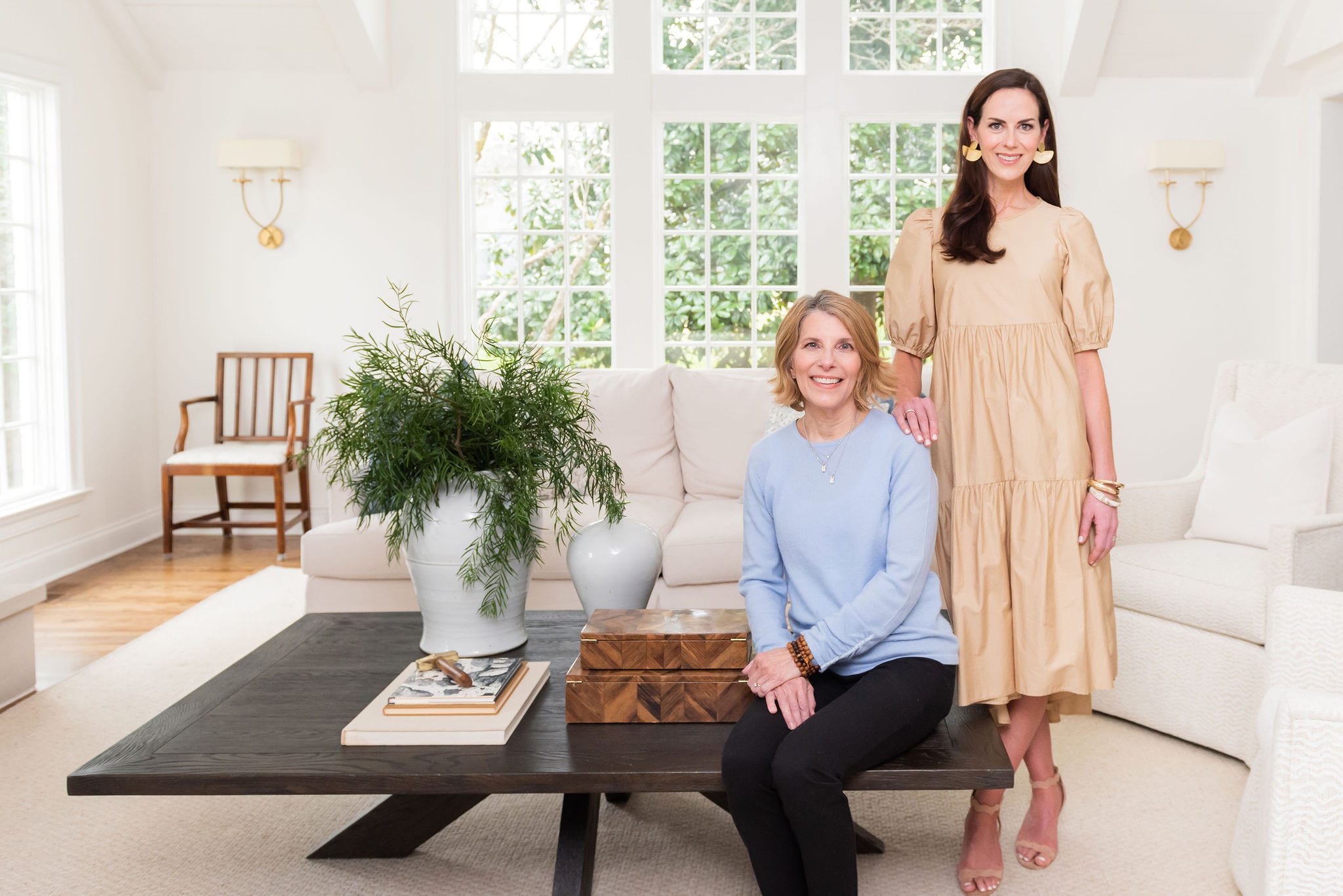
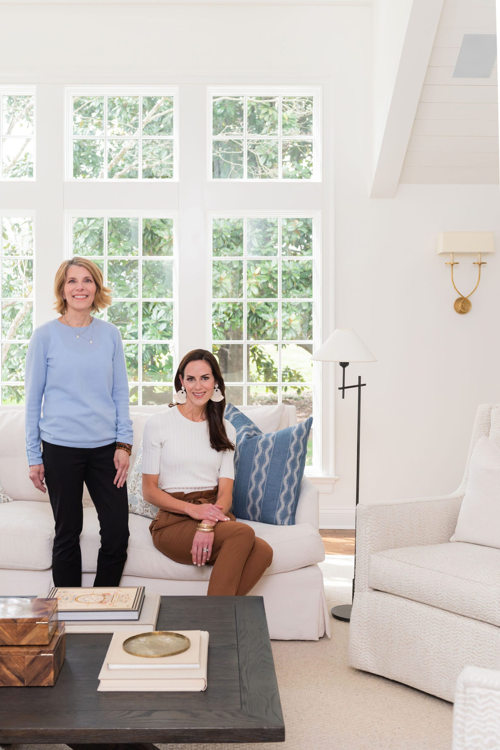
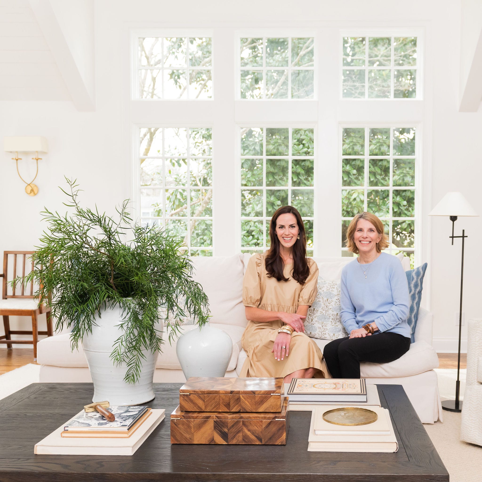
After a few years of growing and living in the space, though, the flaws the home did have came into focus. The time for renovation had come. Hillenmeyer worked with designer Wesley Stanley of Hunt + Gather Design and architect Elizabeth Pogue to help guide their family into a renovation that best served their family.
Ultimately, they all worked together to get exactly what the family needed without taking away any character or changing the home in a way that didn’t work in its surroundings.
“We liked the neighborhood, and we knew we wanted to stay,” Hillenmeyer says. “We’re so glad we renovated it and kept the character. I think that’s what we love the most and what Betsy was really good at doing — preserving what it was and, when adding on, making it feel like effortlessly the same house.”
A native Nashvillian, Pogue was very familiar with Green Hills architecture, having previously worked on nearby 1940s-era homes like the Hillenmeyers’, which had already been renovated once from its original two-bedroom, one-bath layout.
So when the family discussed tearing the whole thing down and starting from scratch if was what made the most sense, Pogue was happy to draw up an option that kept the character of the house but still gave the family all the extra room they needed for a master suite and kitchen expansion.
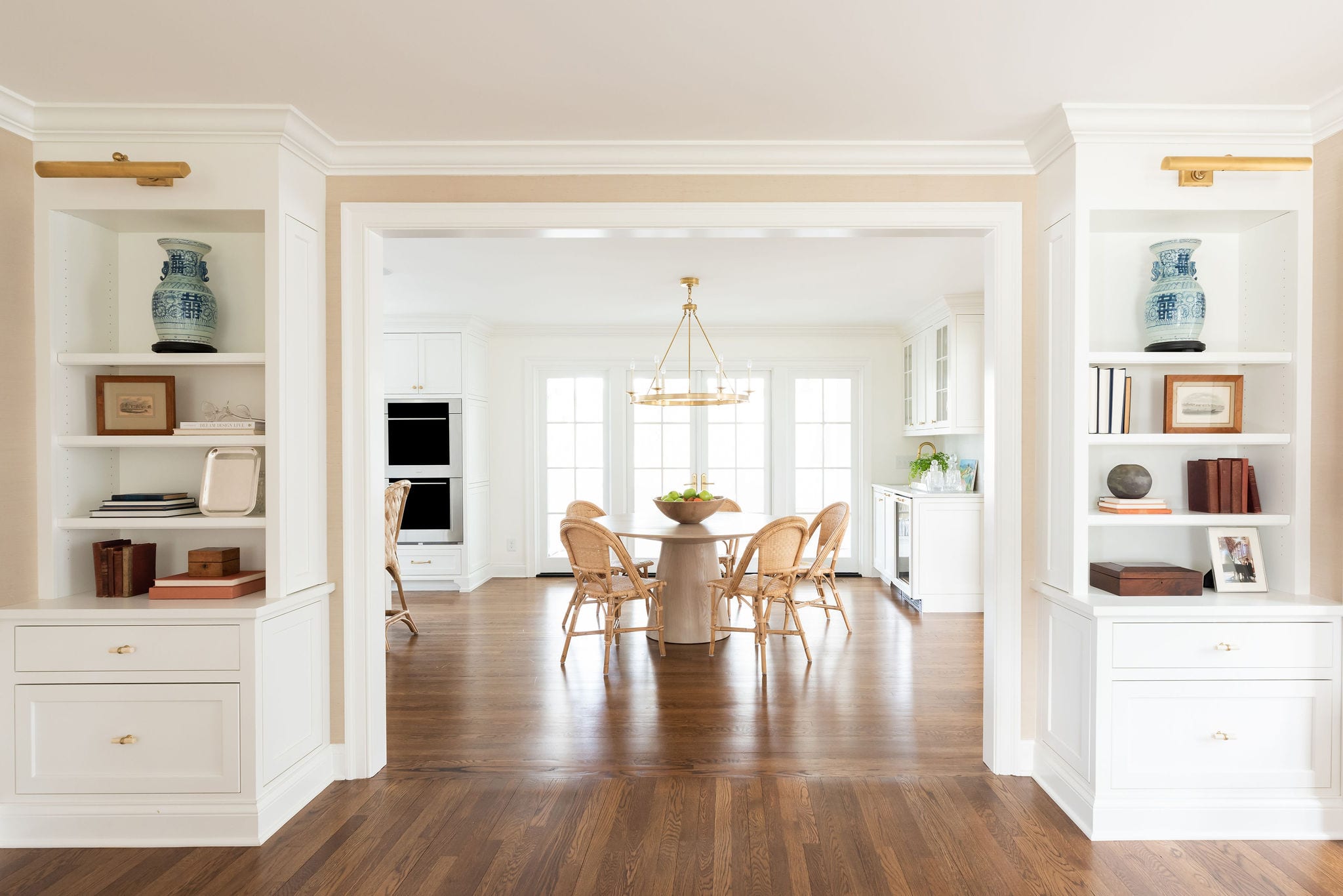
“I really thought there was a lot of charm to that house,” Pogue says. “I was able to come up with a plan that they really liked while keeping the house.” Working with the Hillenmeyers and Stanley, a final plan was approved and executed that almost doubled the footprint to 5,000 square feet — all in the back, so what faces the street still looks like the quaint cottage it always was.
“You can look at the front of it, and it looks the same now as it did when it was originally built,” Pogue says. “You don’t notice any change until you walk around the side and to the back.”
That is where Pogue designed all of the extra space to almost wrap around the new and improved screen porch like a courtyard.
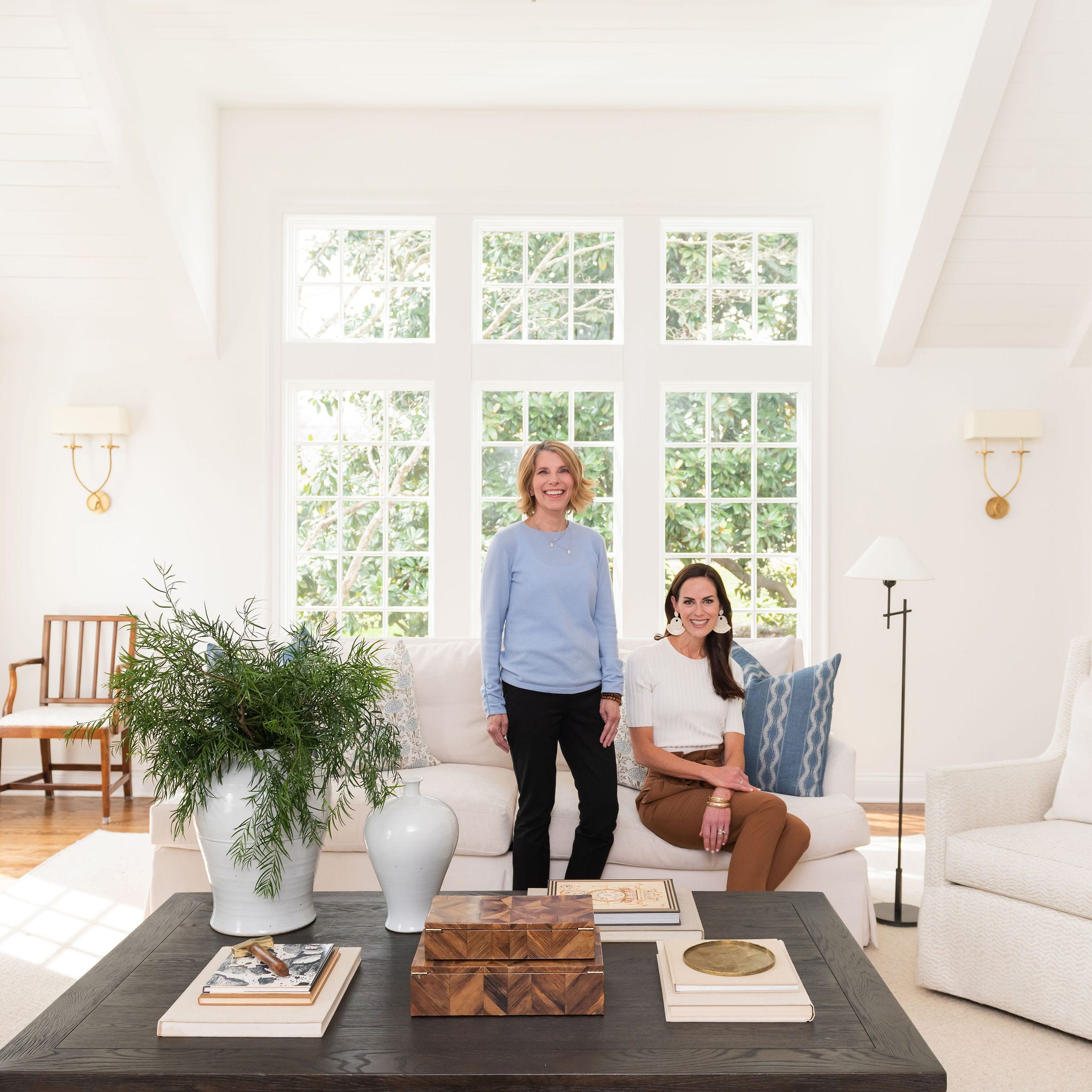
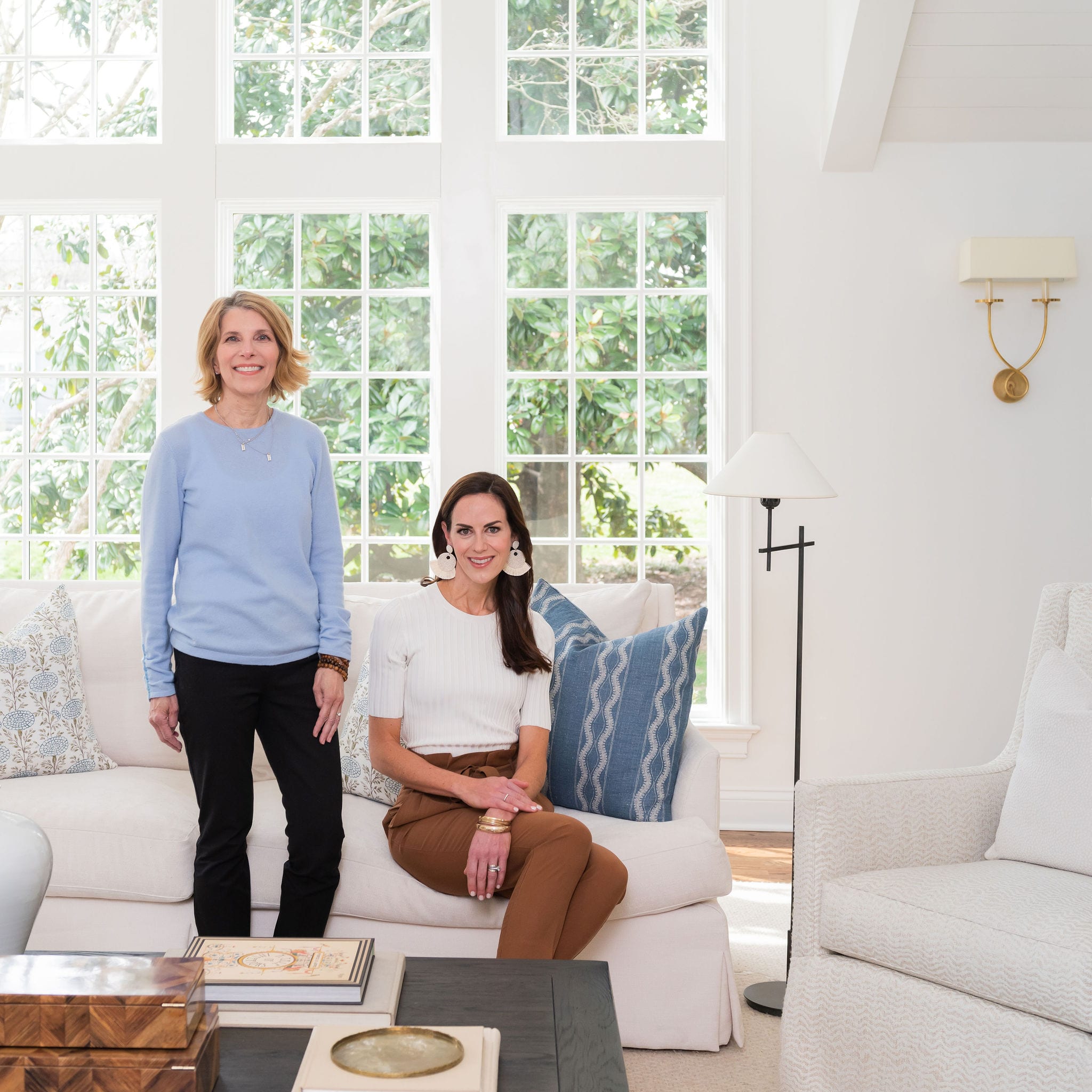
“It’s almost as if we have a whole other room on our house,” Hillenmeyer says. “And on nice days, like Easter, we open all the French doors and it really feels like it’s almost part of the house. So we hope spring days last a little bit longer.”
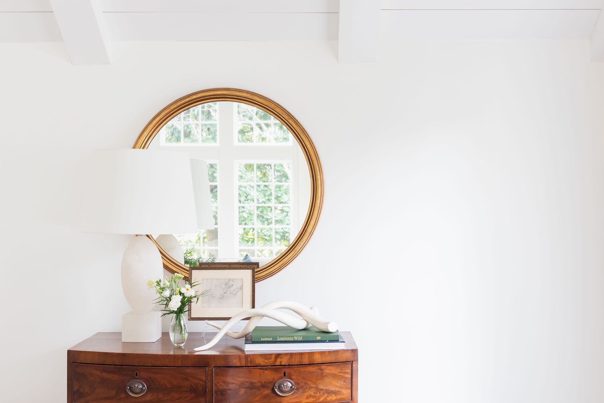
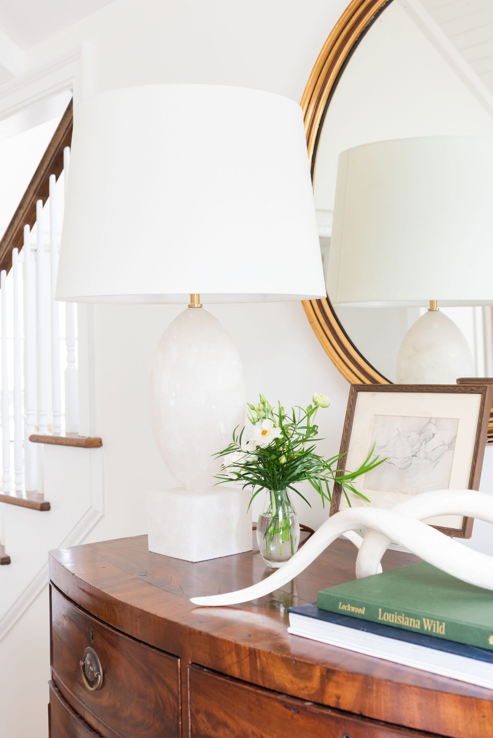
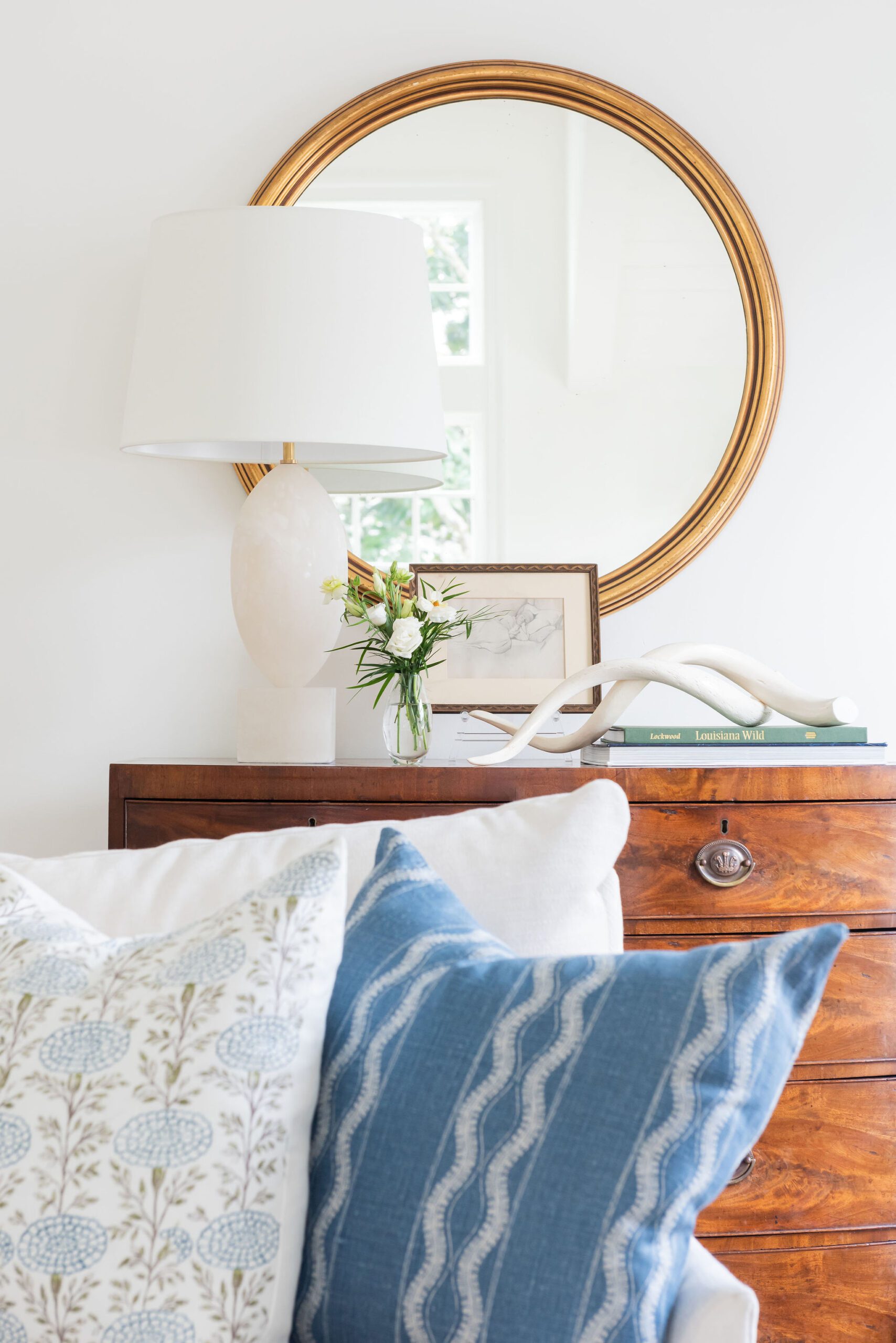
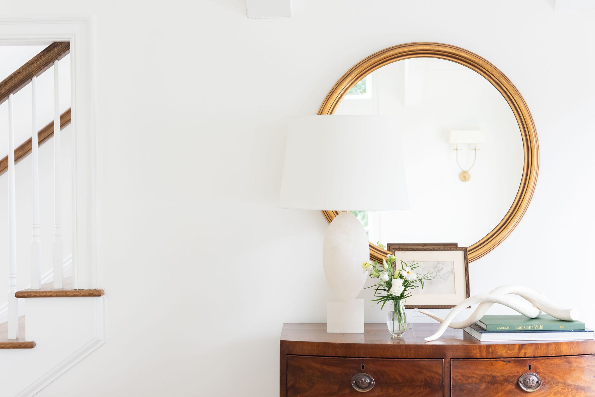
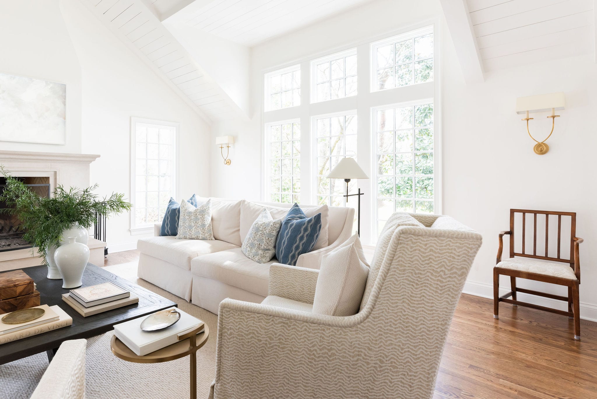
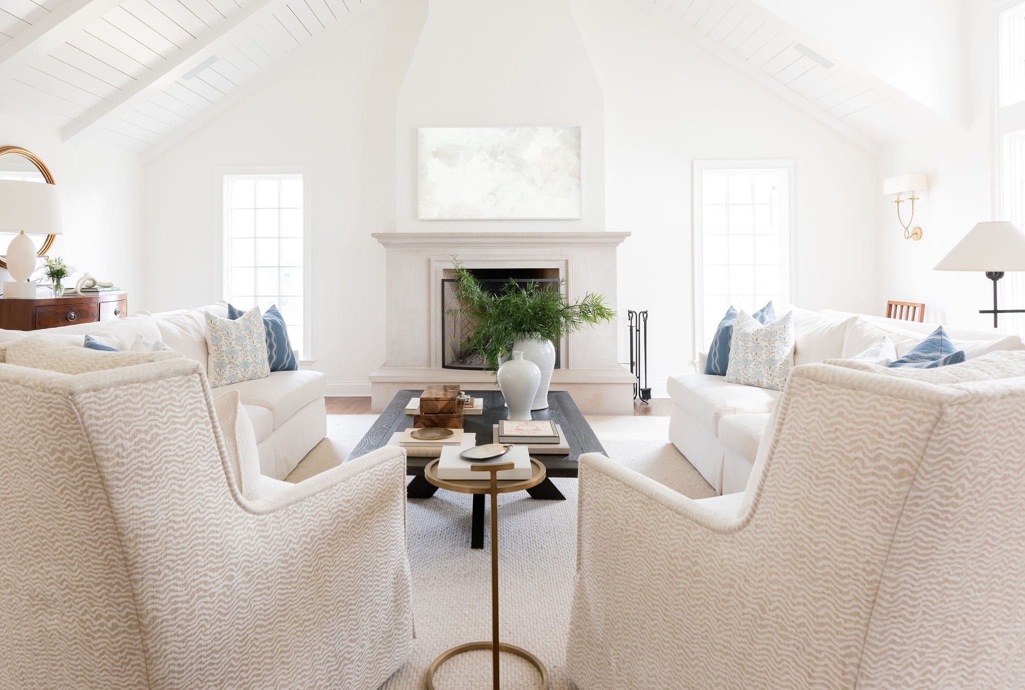
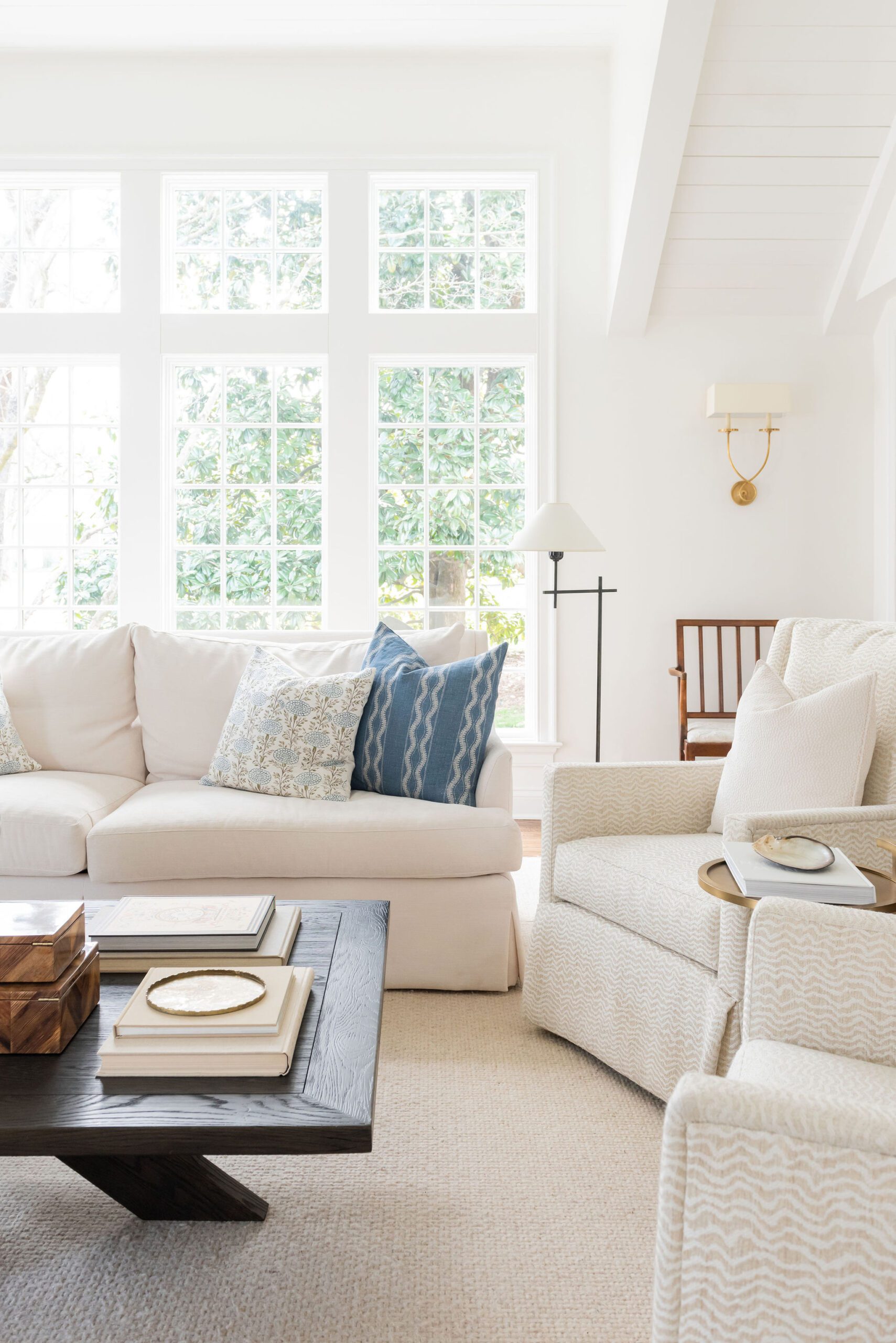
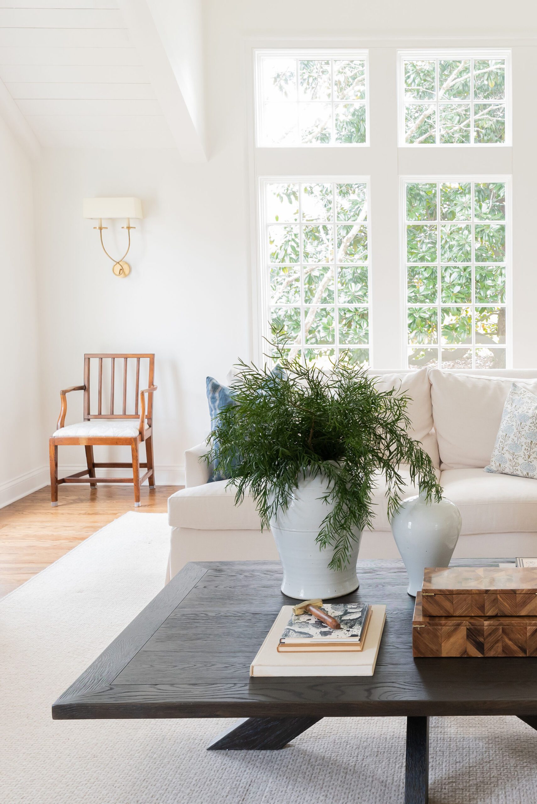
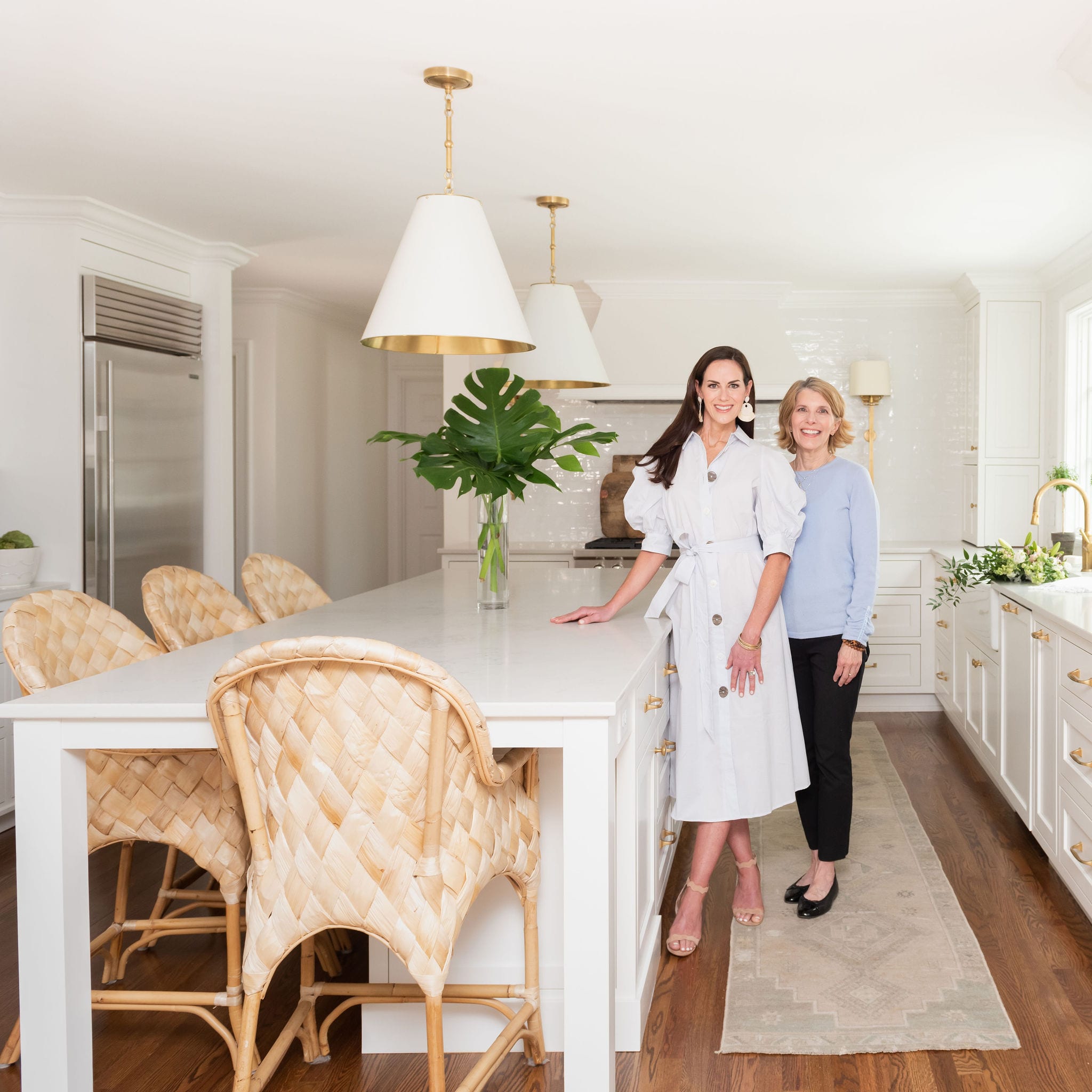
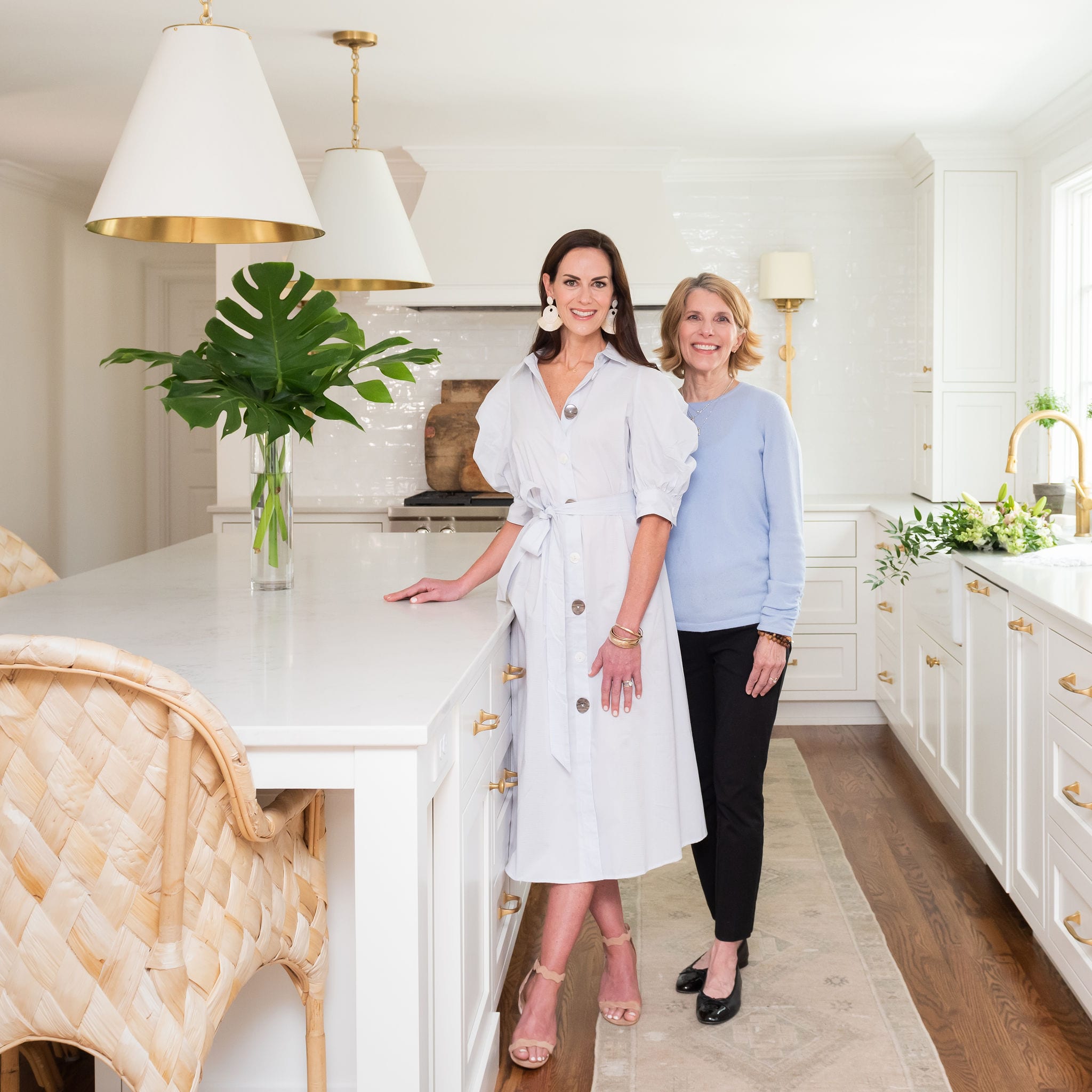
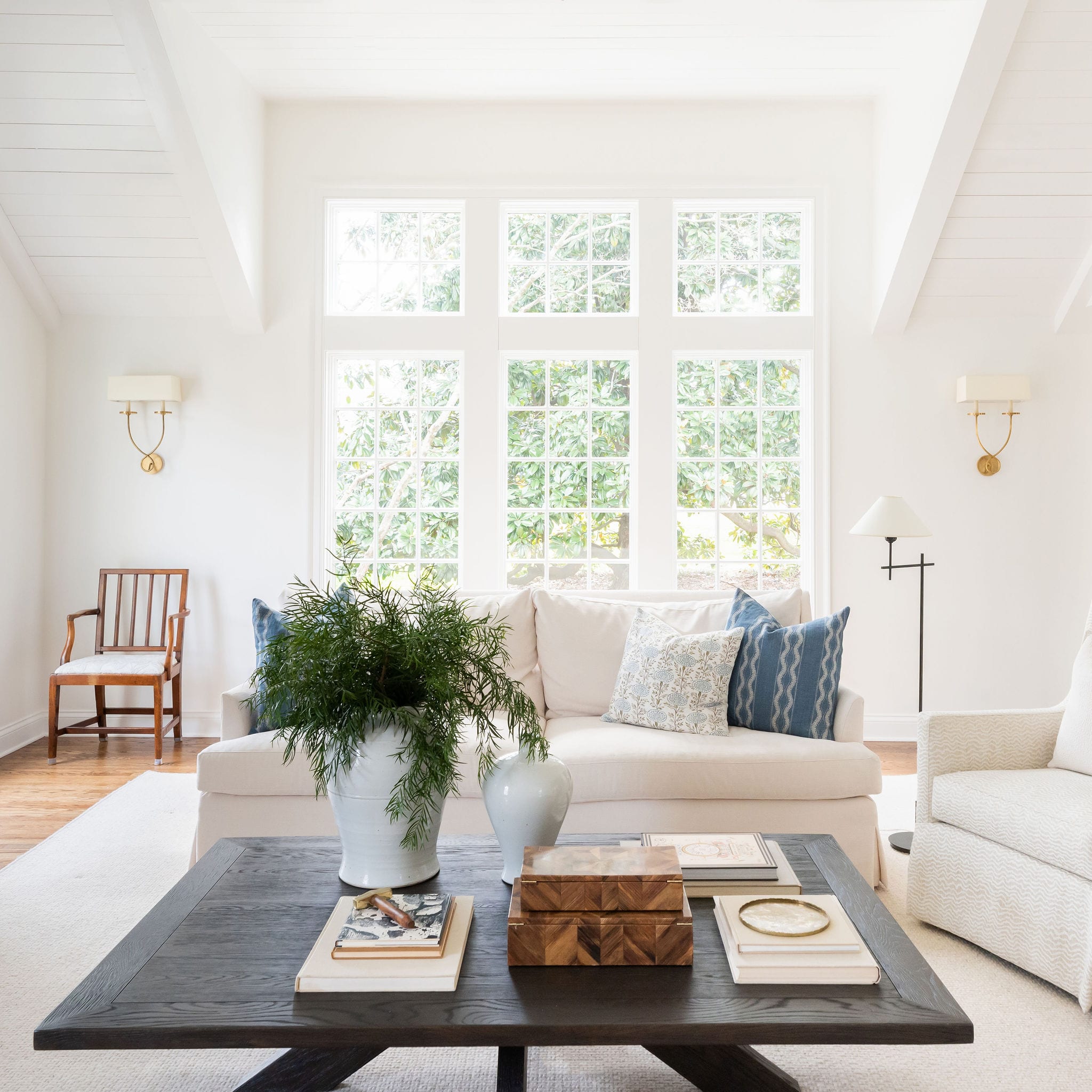
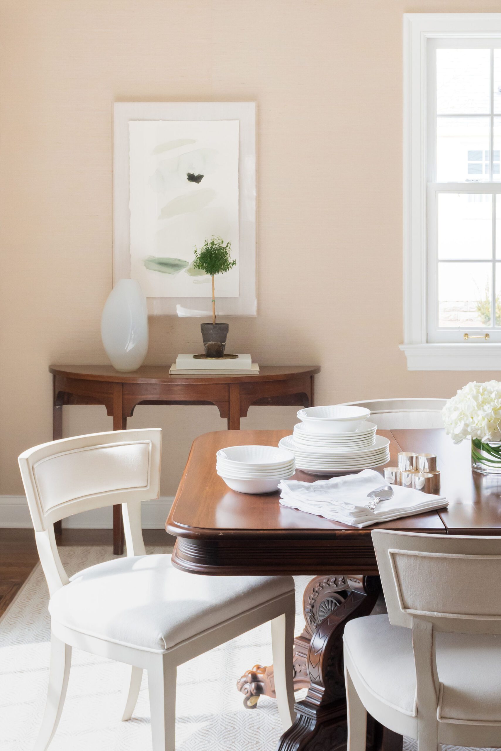
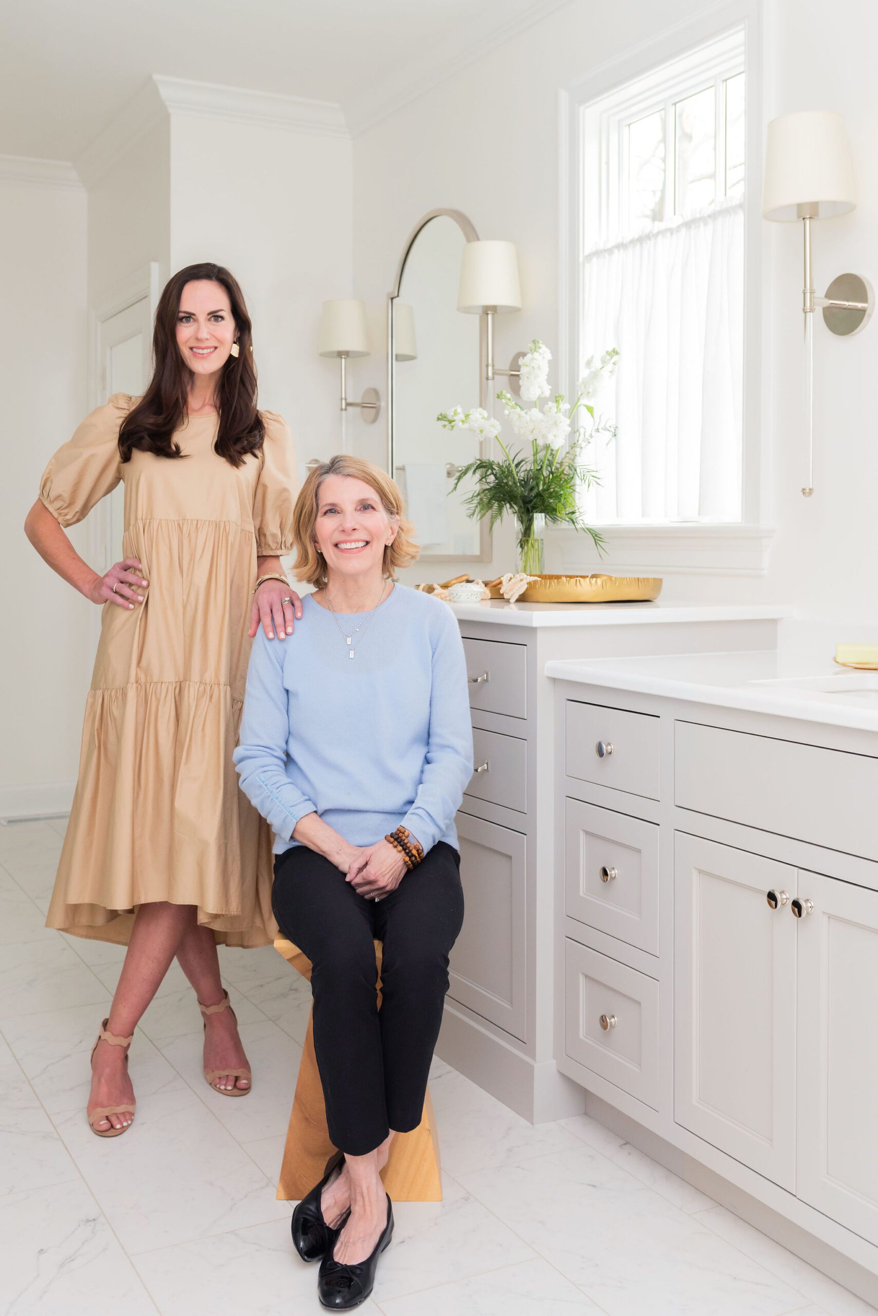
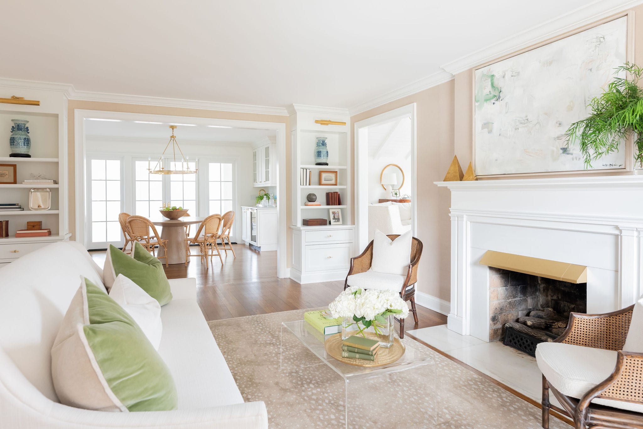
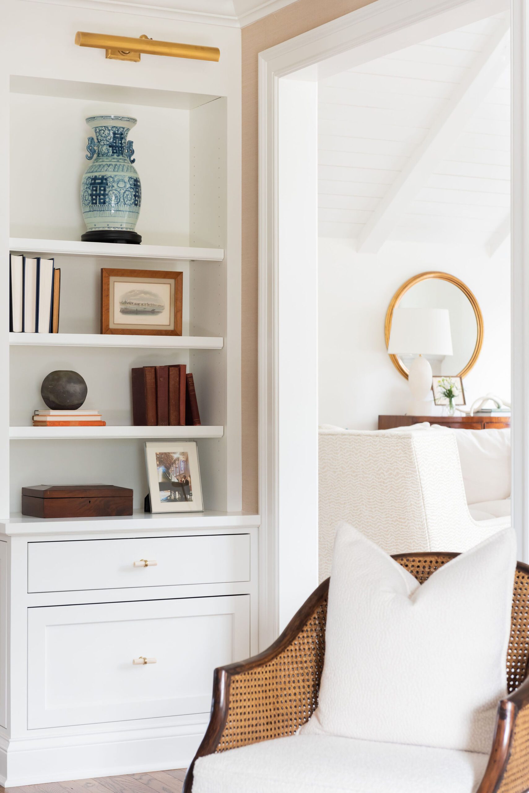
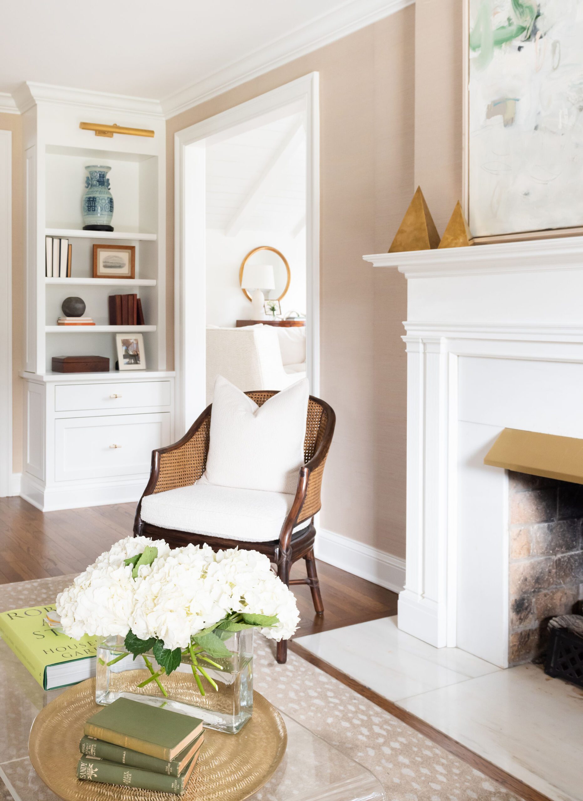
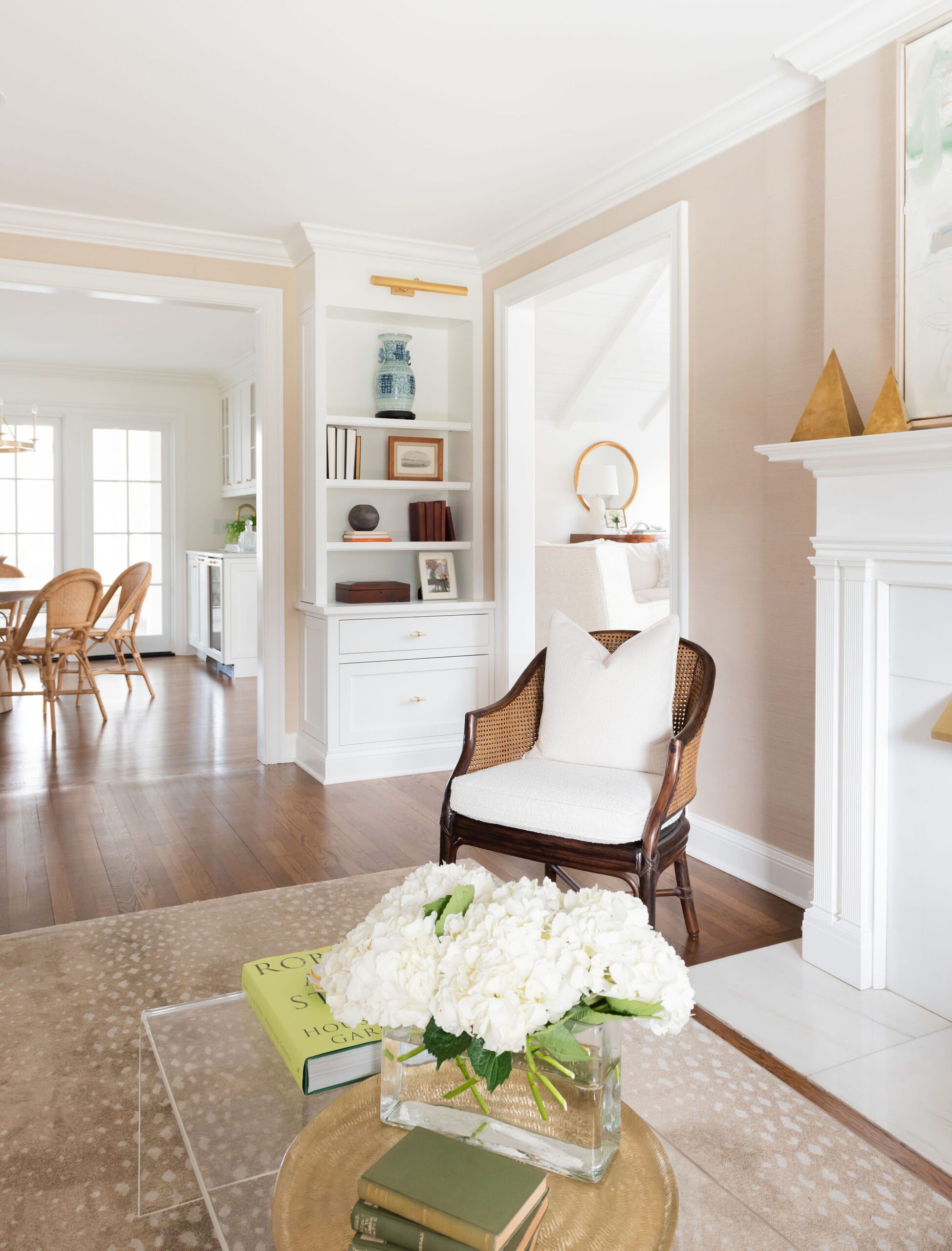
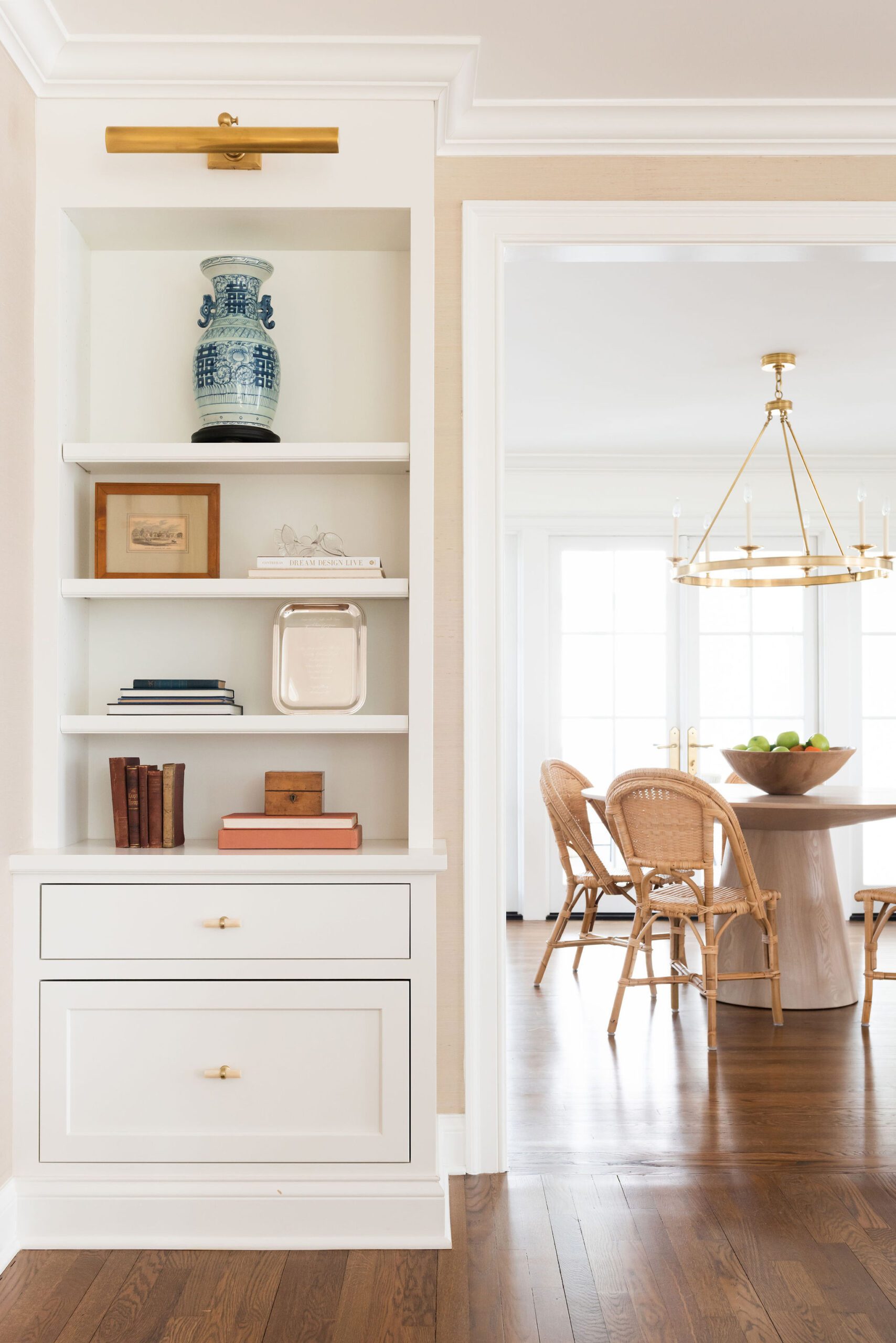
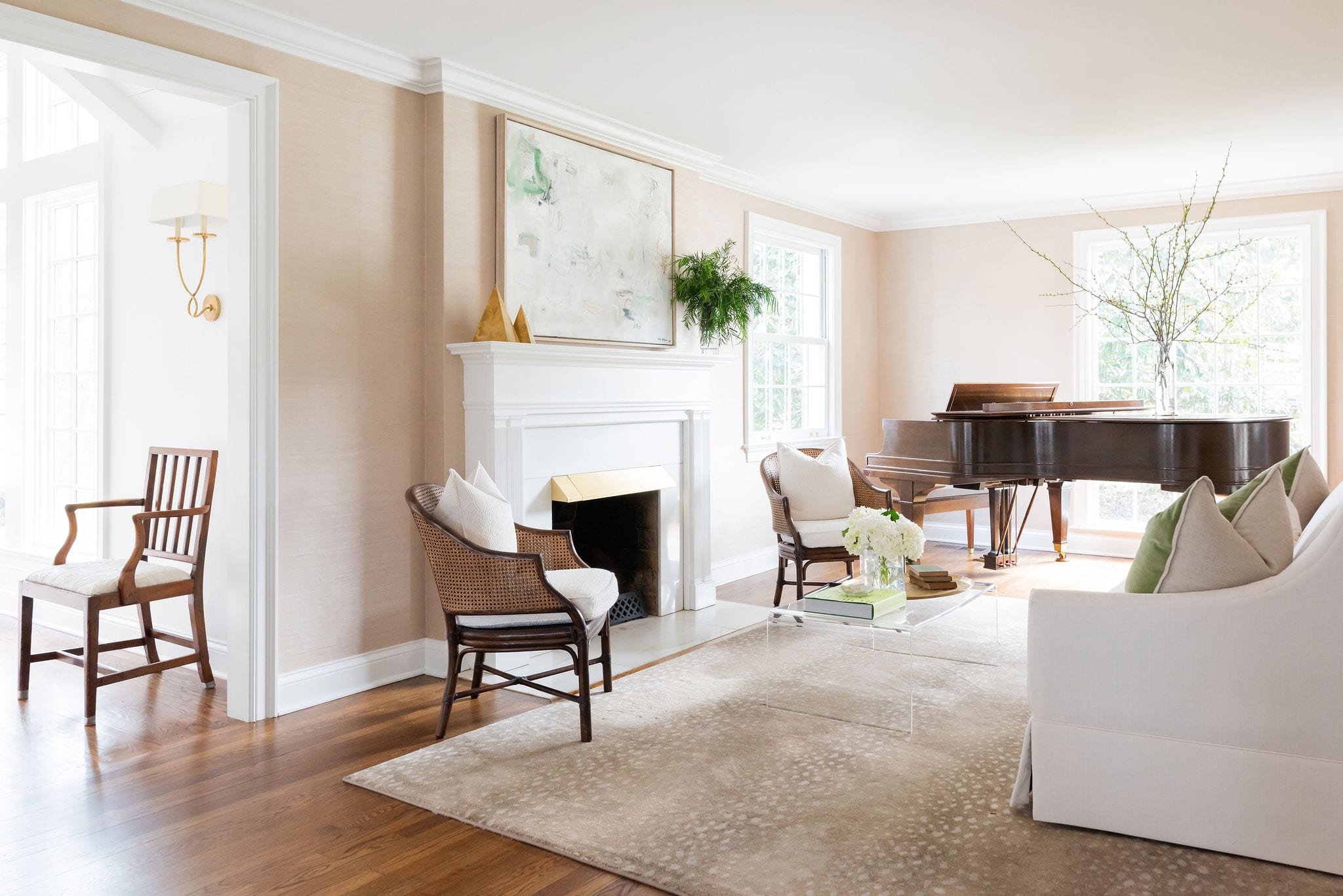
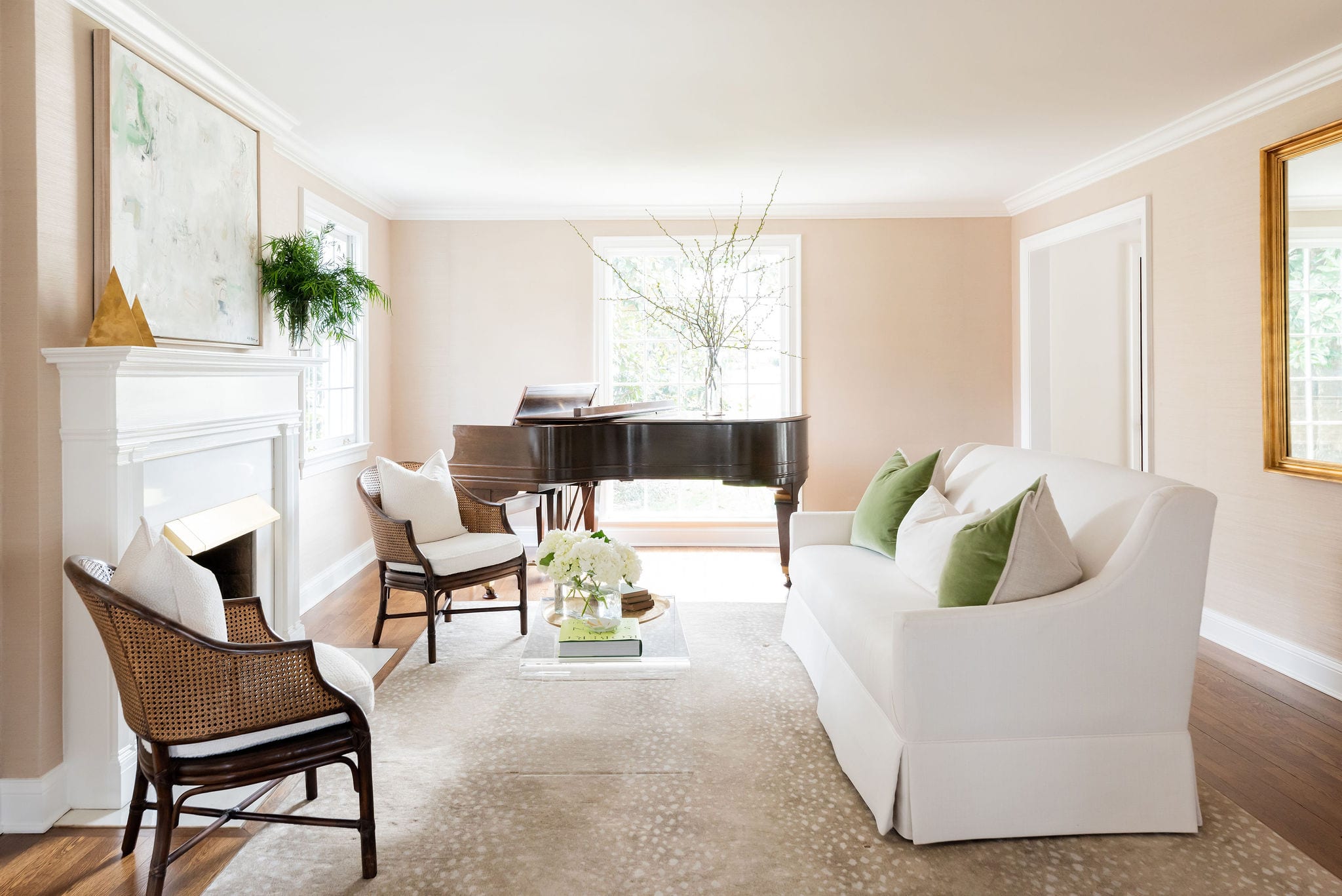
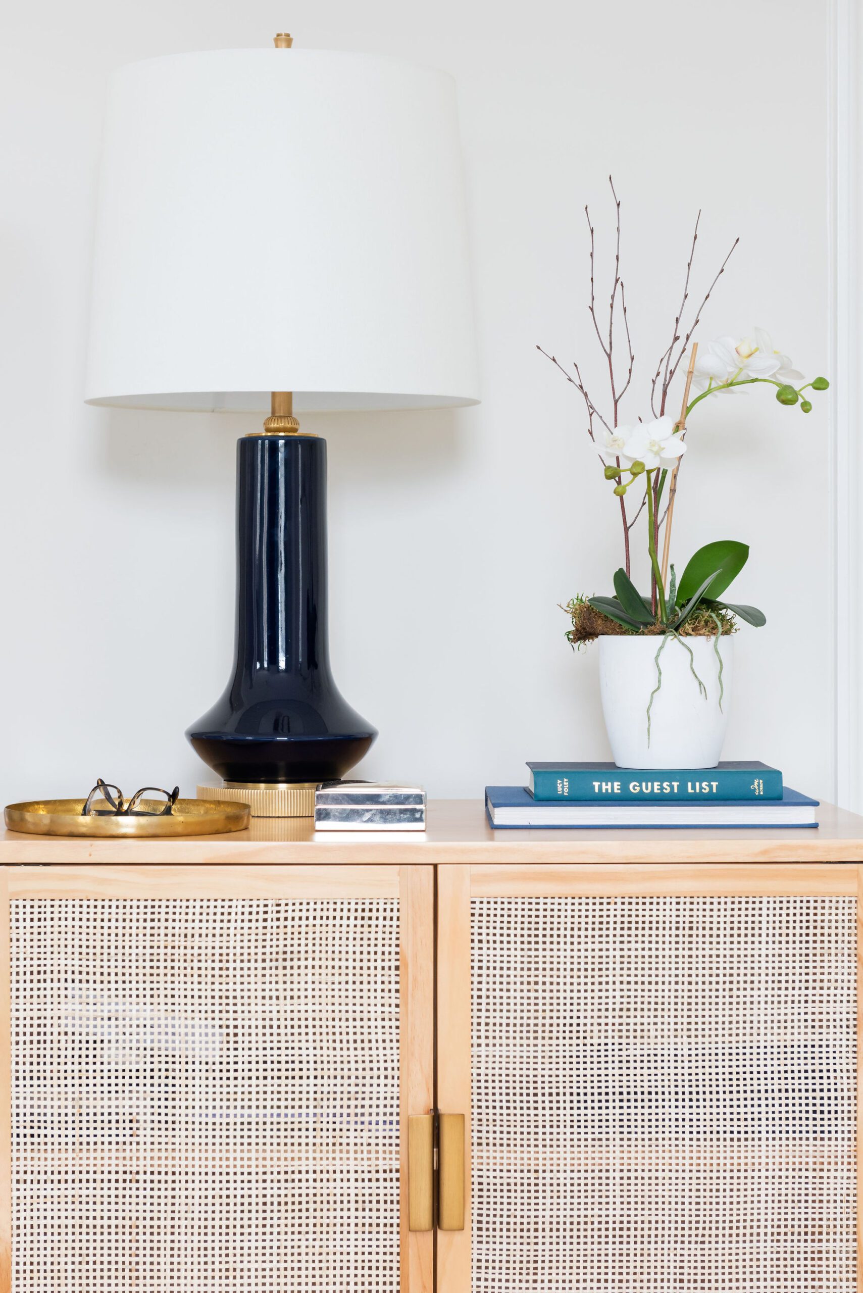
What Pogue accomplished with the renovation, Stanley did with the design: mixing old and new, taking the family’s heirlooms and combining them with more modern pieces, giving Hillenmeyer the contemporary feel she wanted without losing the meaningful items that she loved. She turned to Marketplace Interiors, Patina + Co. and Ash Blue for special pieces to add.
“This is the house they brought their second child home to, the house that was the grownup house after their ‘we just got married house,’” Stanley says. “To be able to navigate all those transitions in the same spot, and have your house keep evolving, and to be able to take it to ‘forever house’ level is really special.”
Finding the right light
Because Stanley had known Hillenmeyer a while, she was really tapped into her tastes and style of living. In fact, the front powder room was one of Stanley’s first design projects in Nashville years ago, pre-renovation.
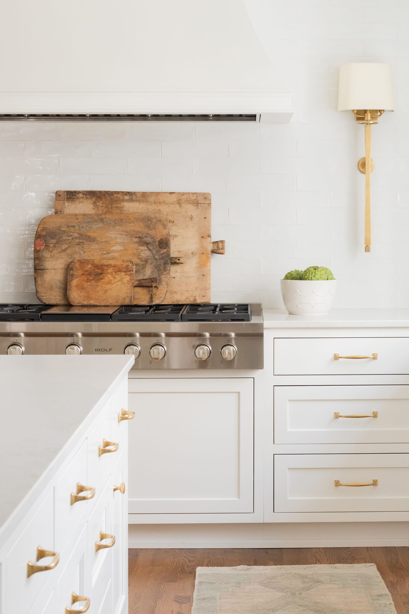
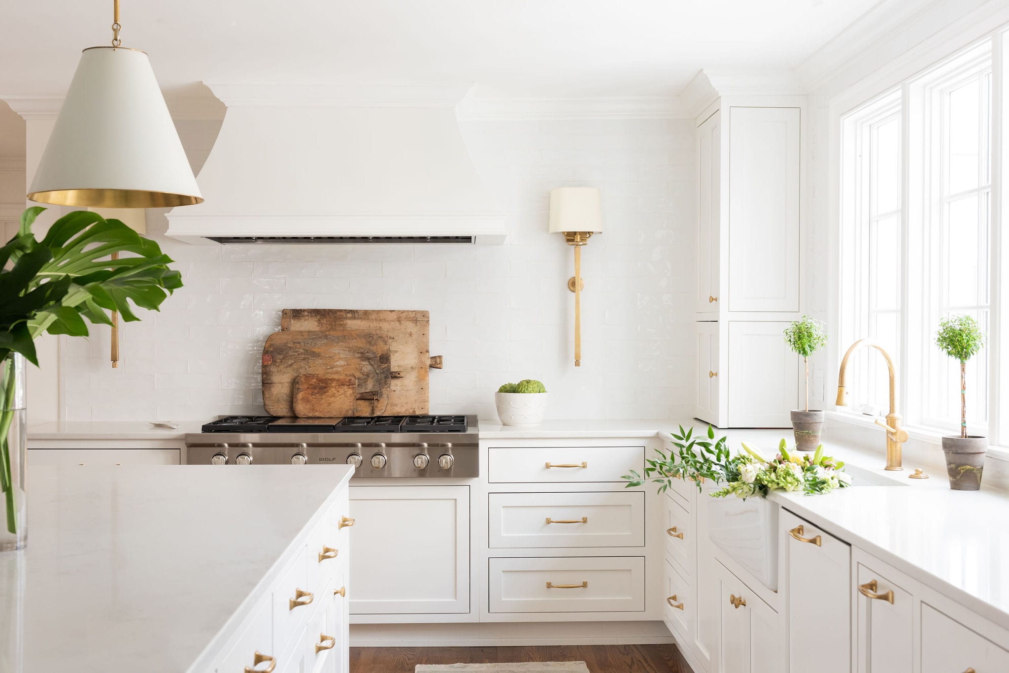
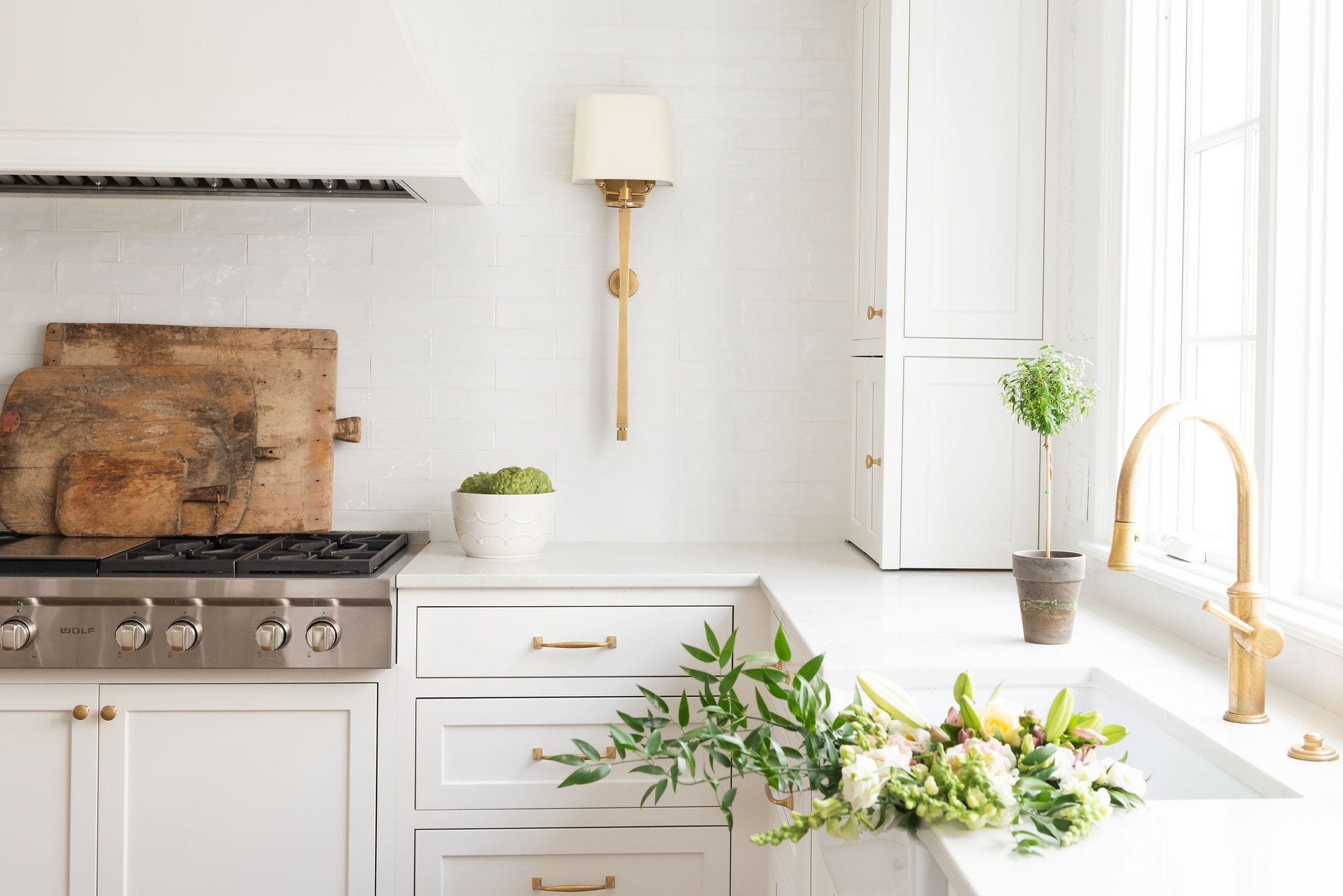
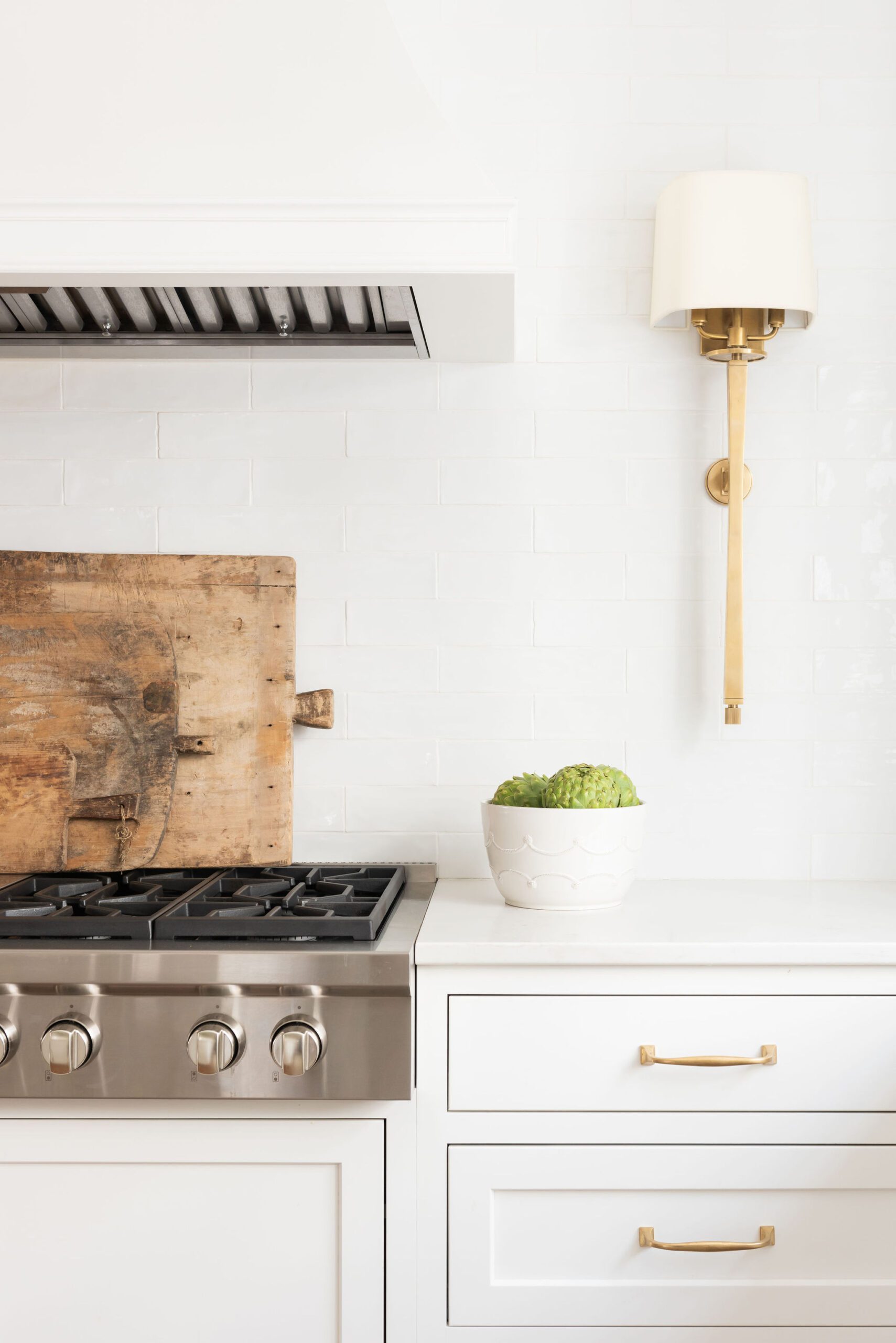
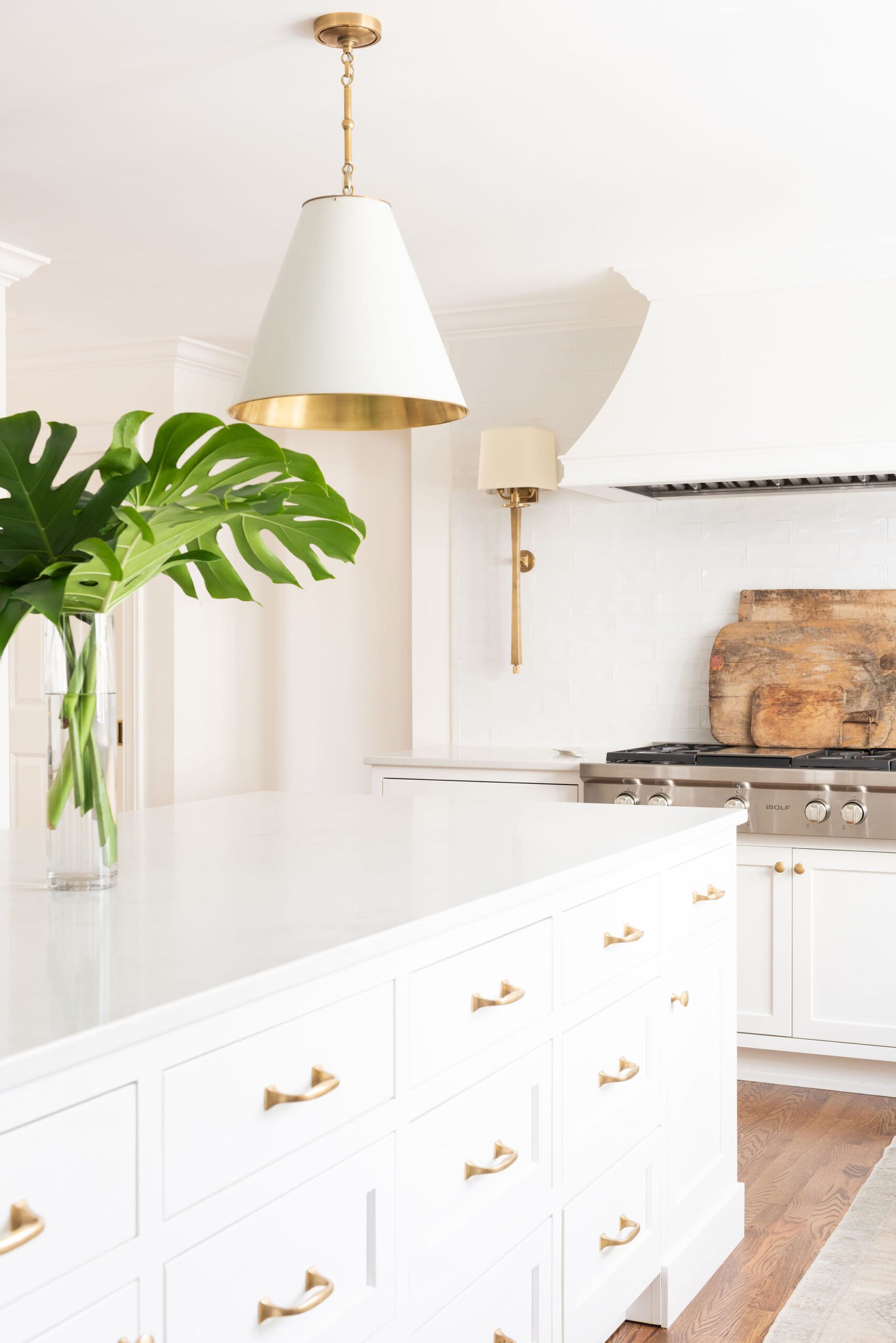
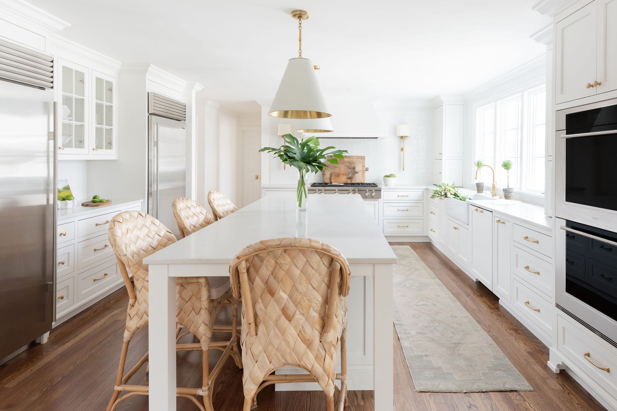
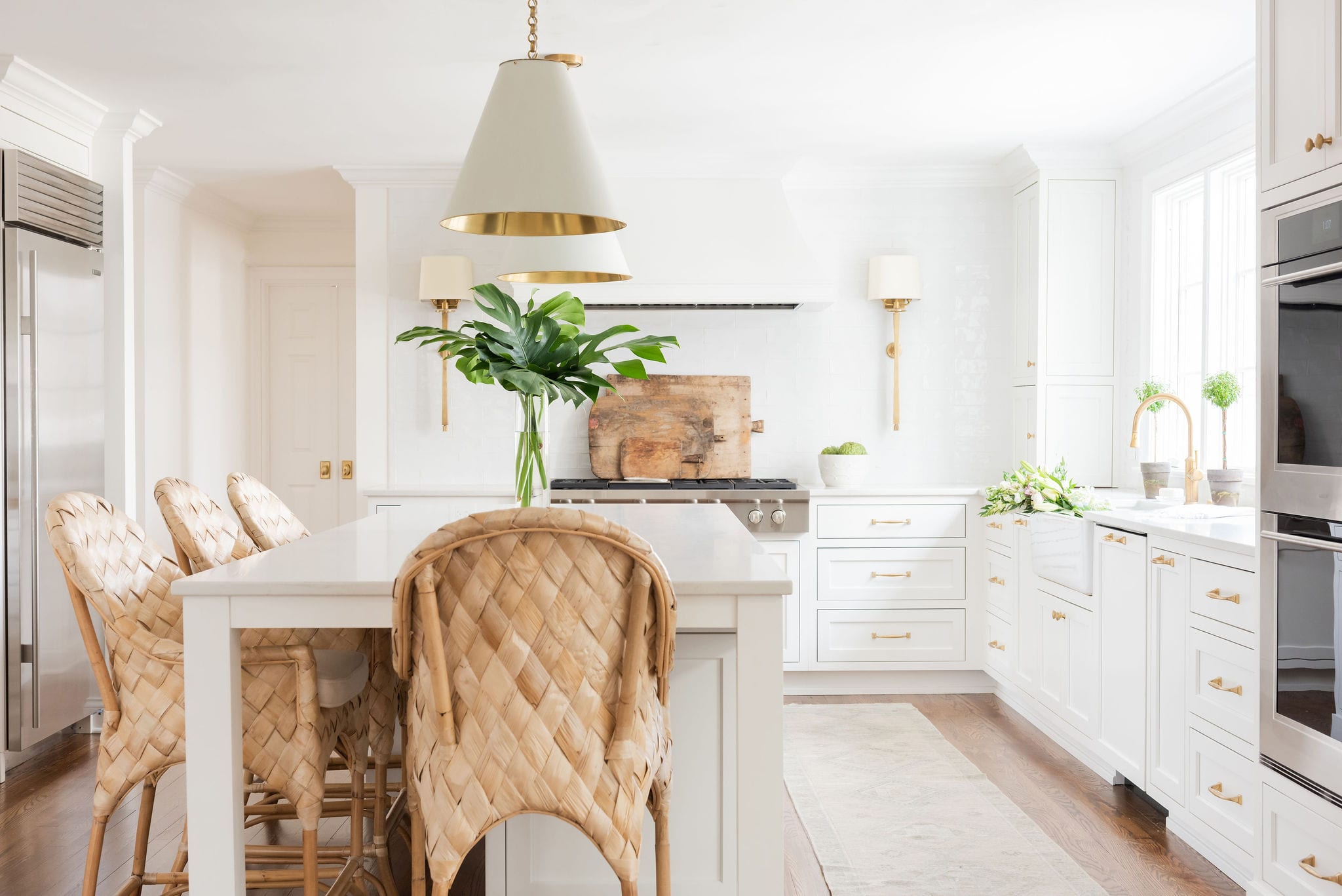
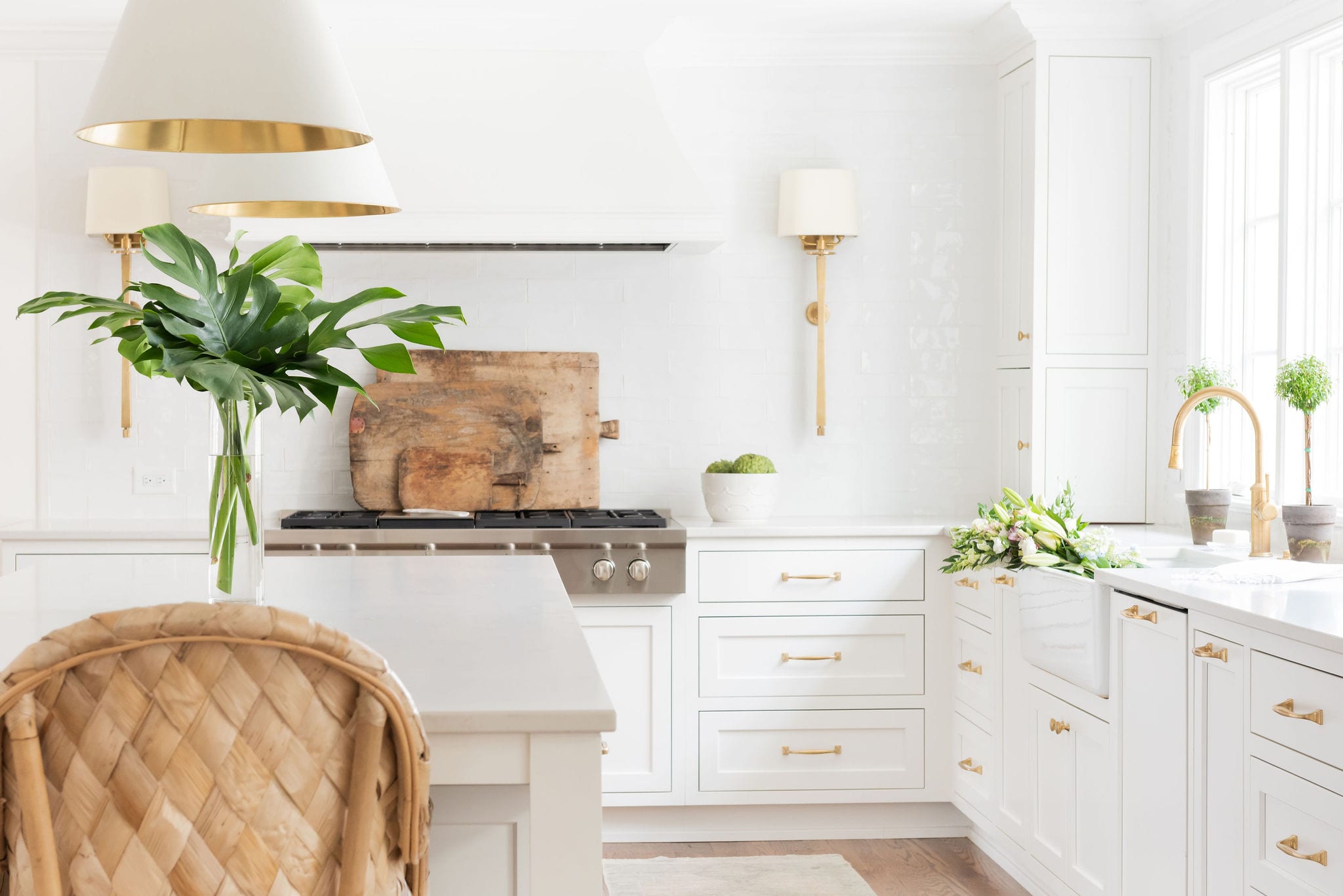
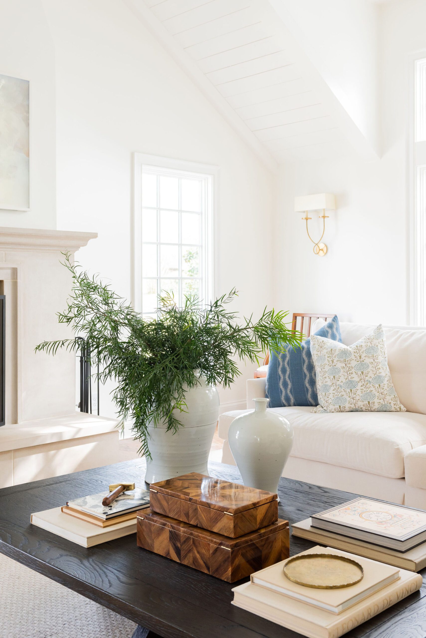
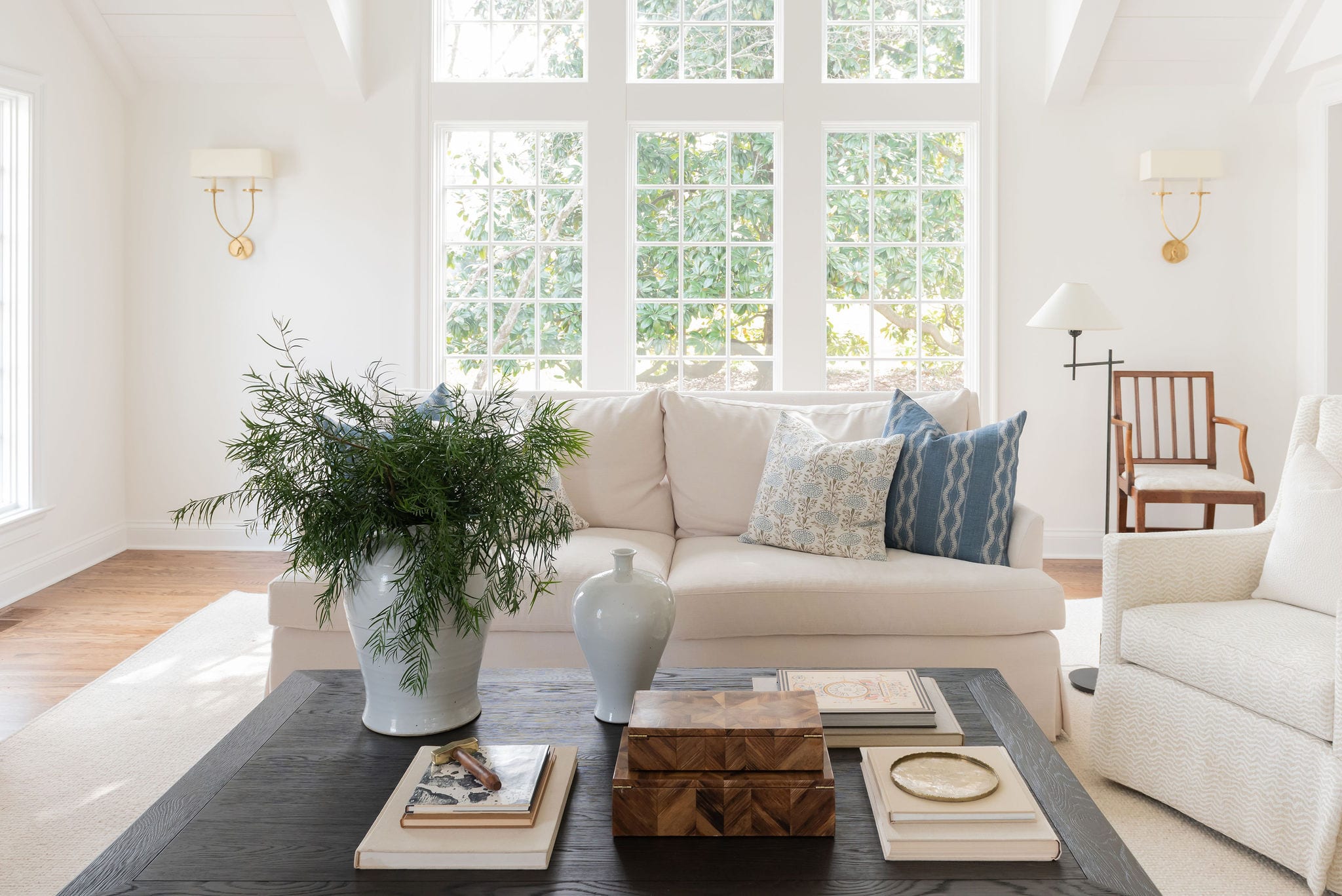
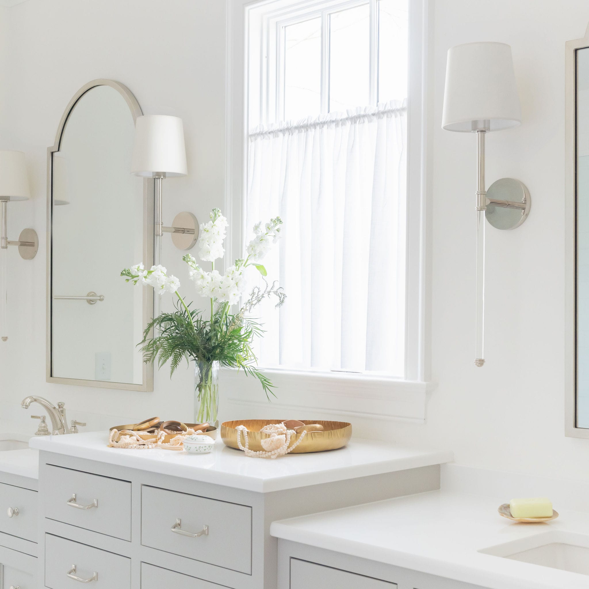
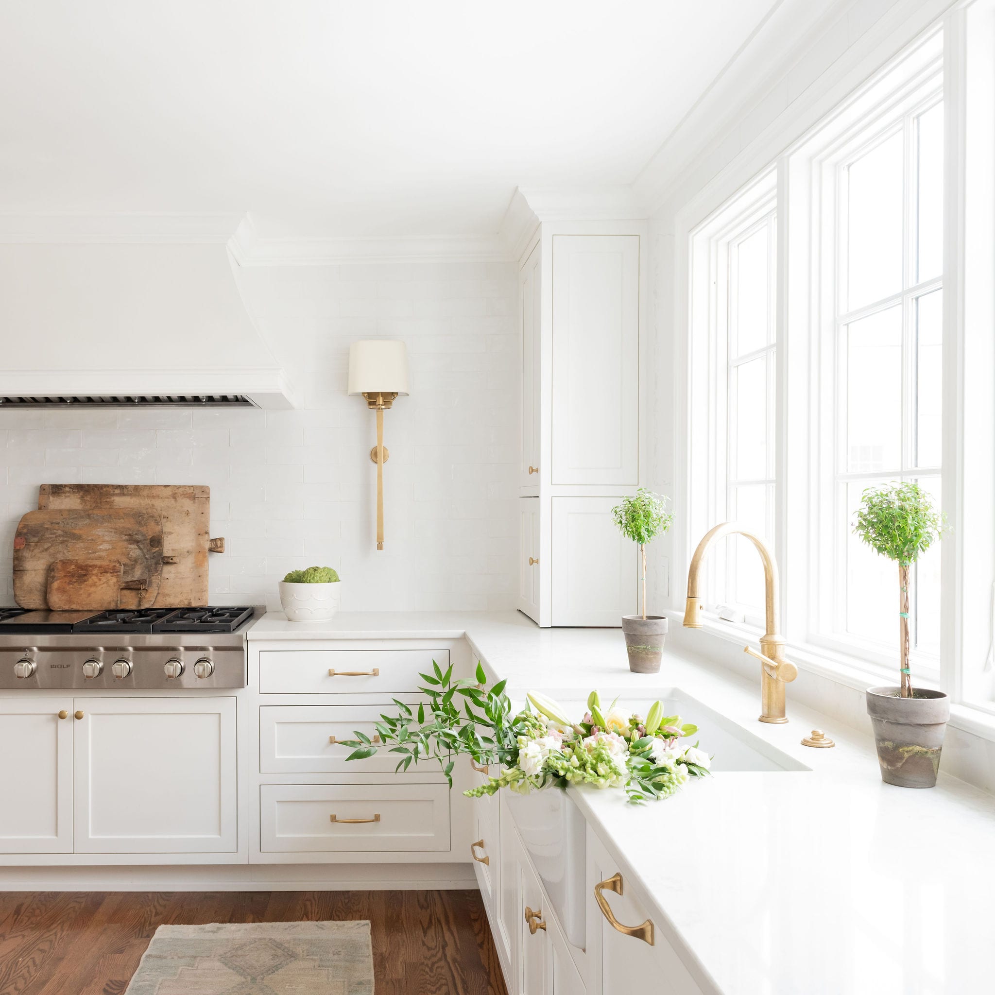
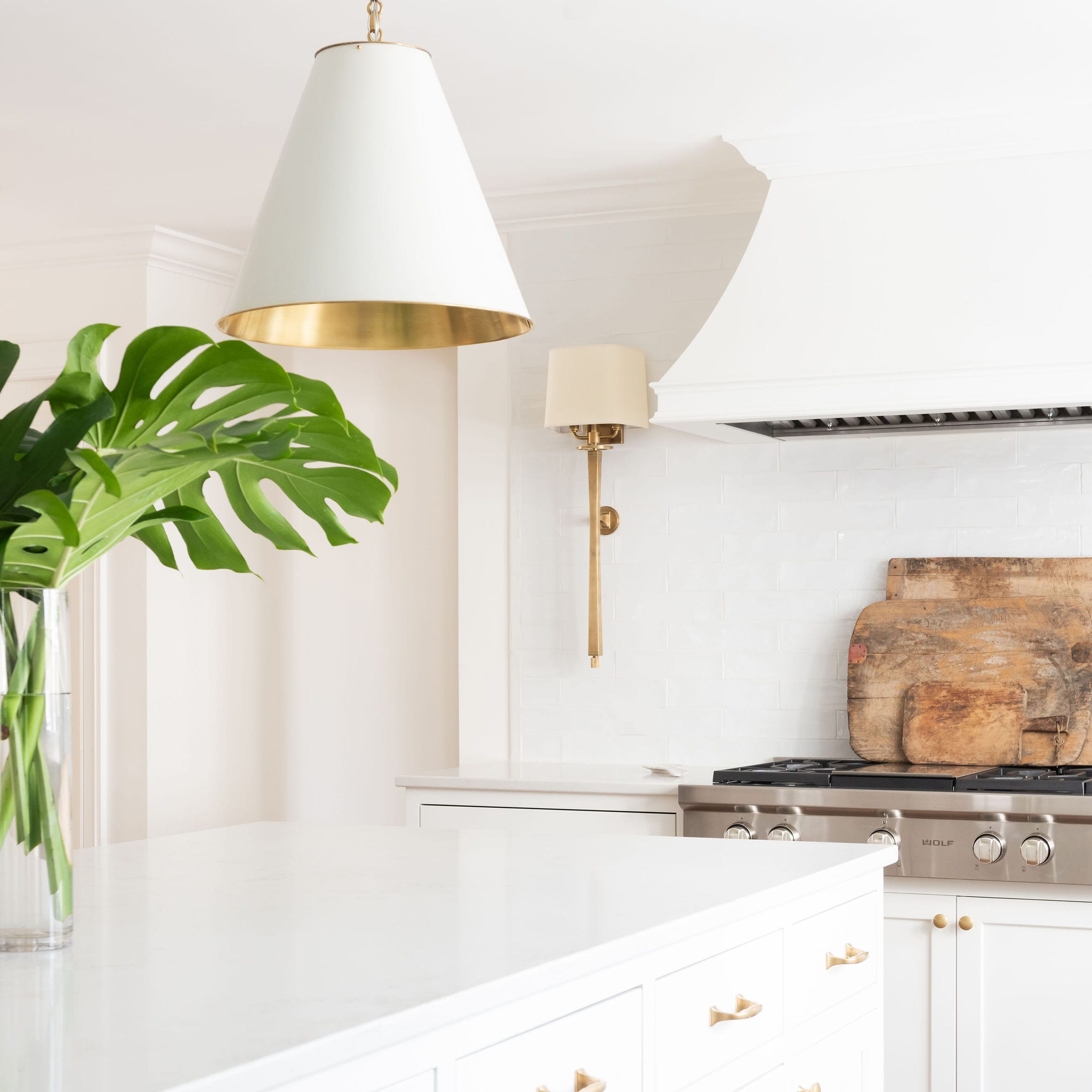
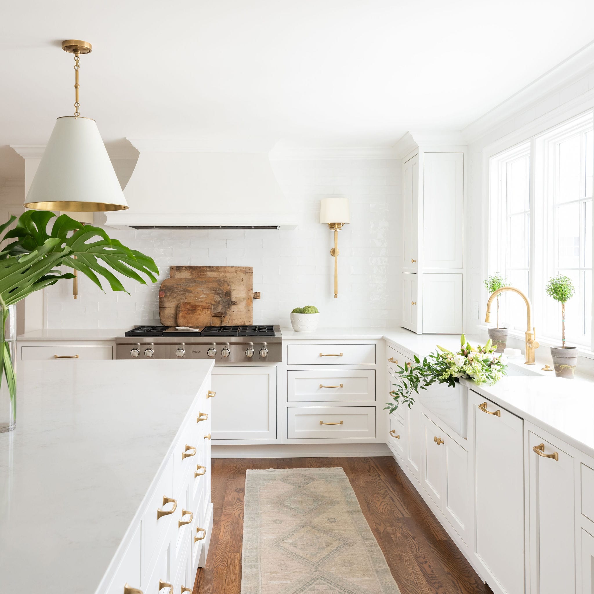
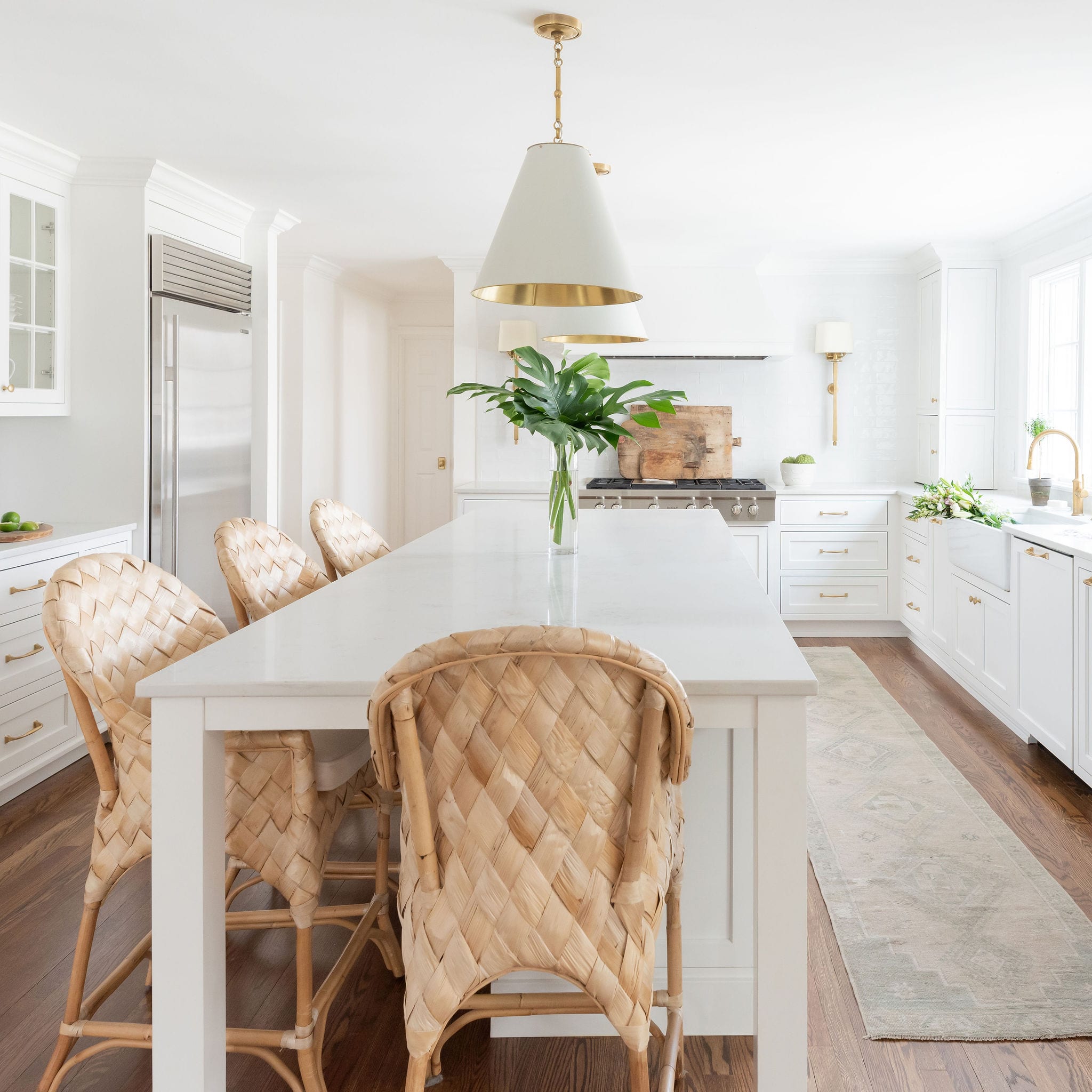
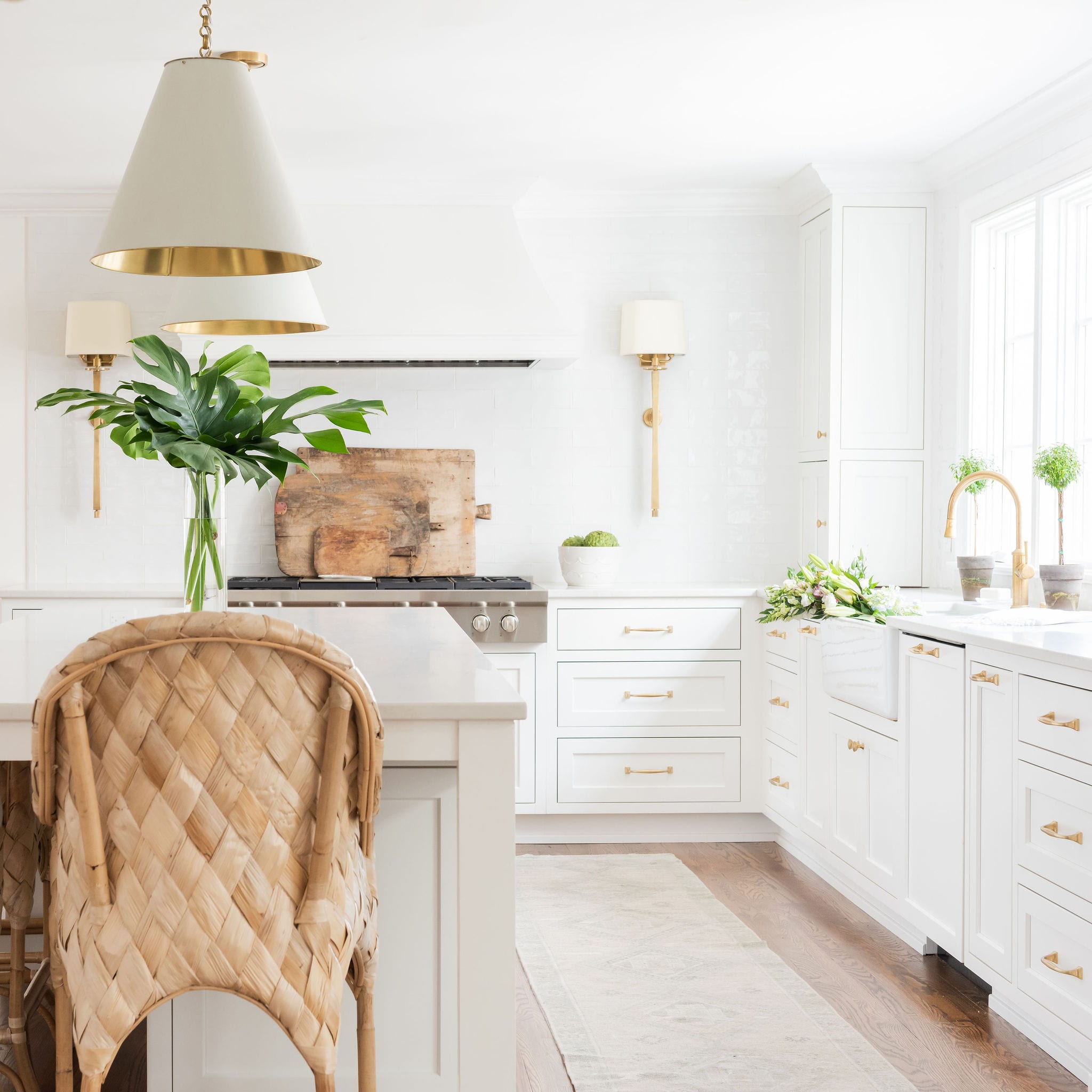
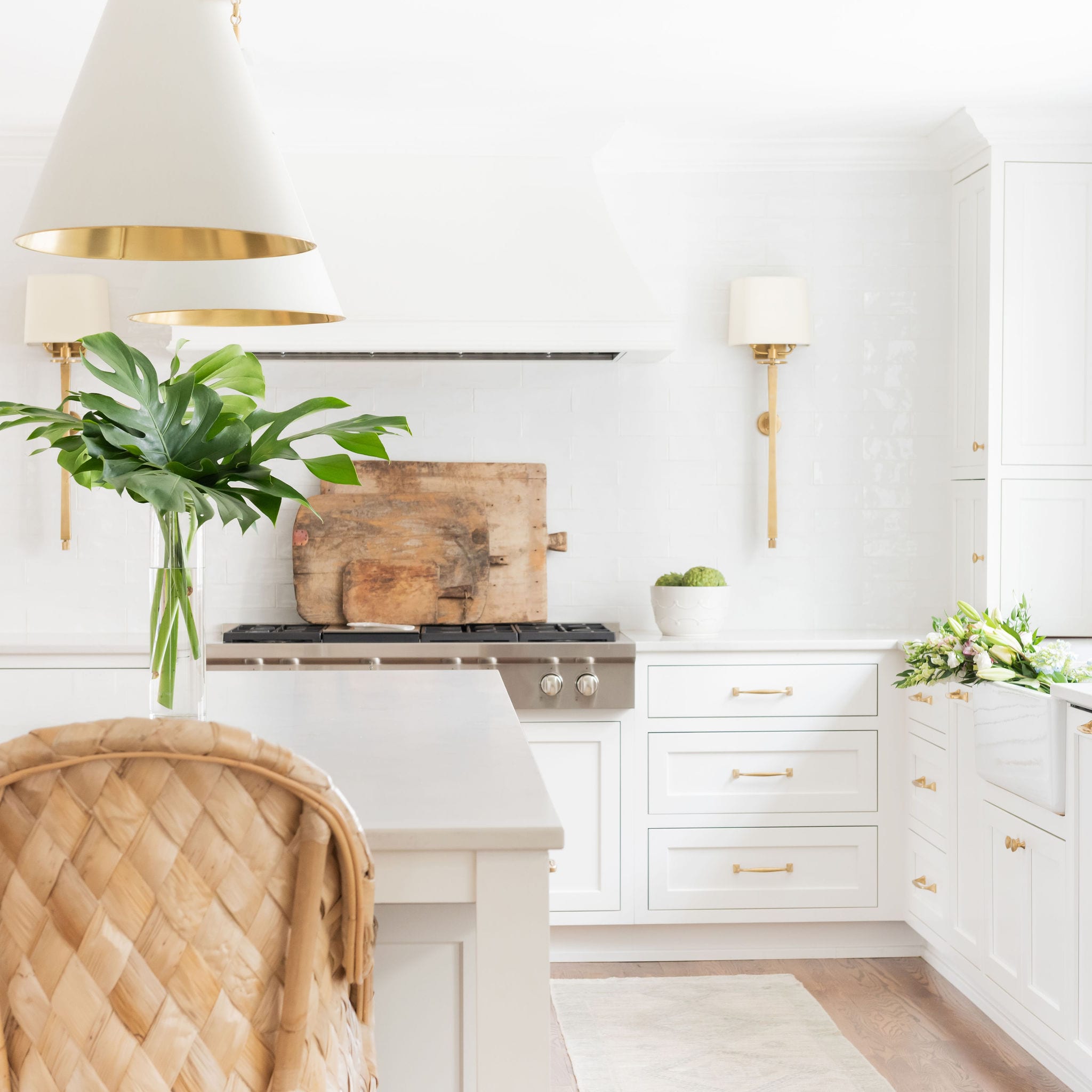
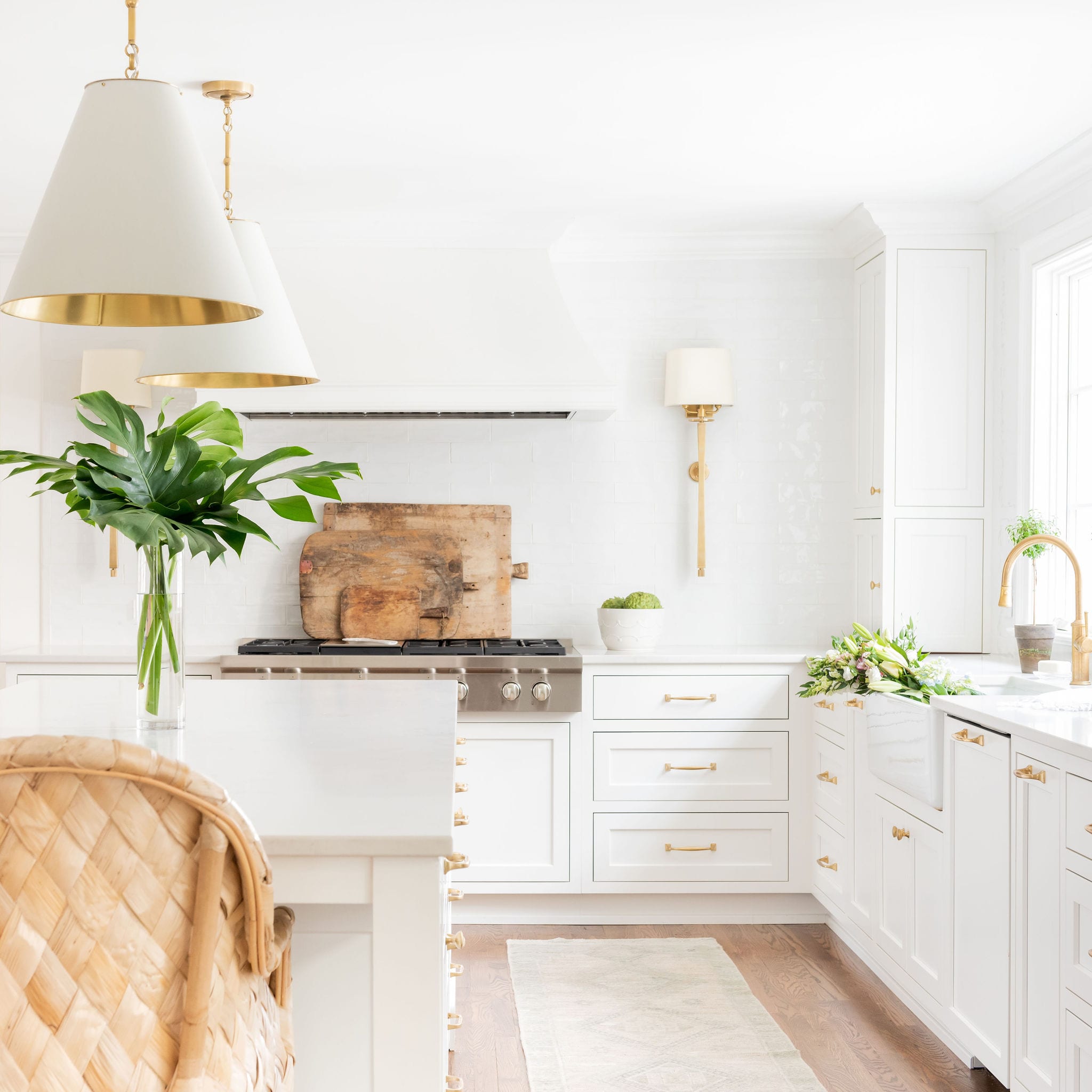
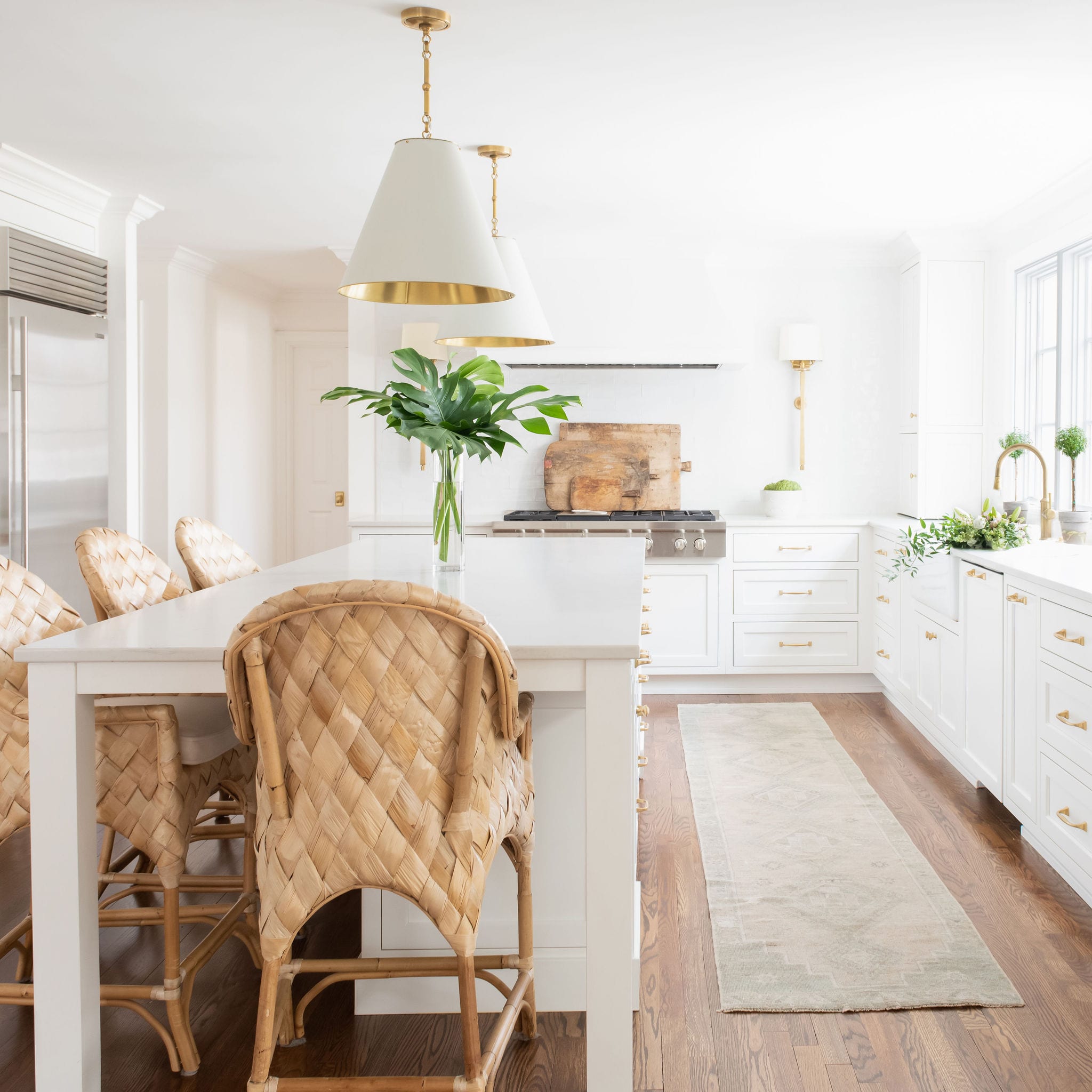
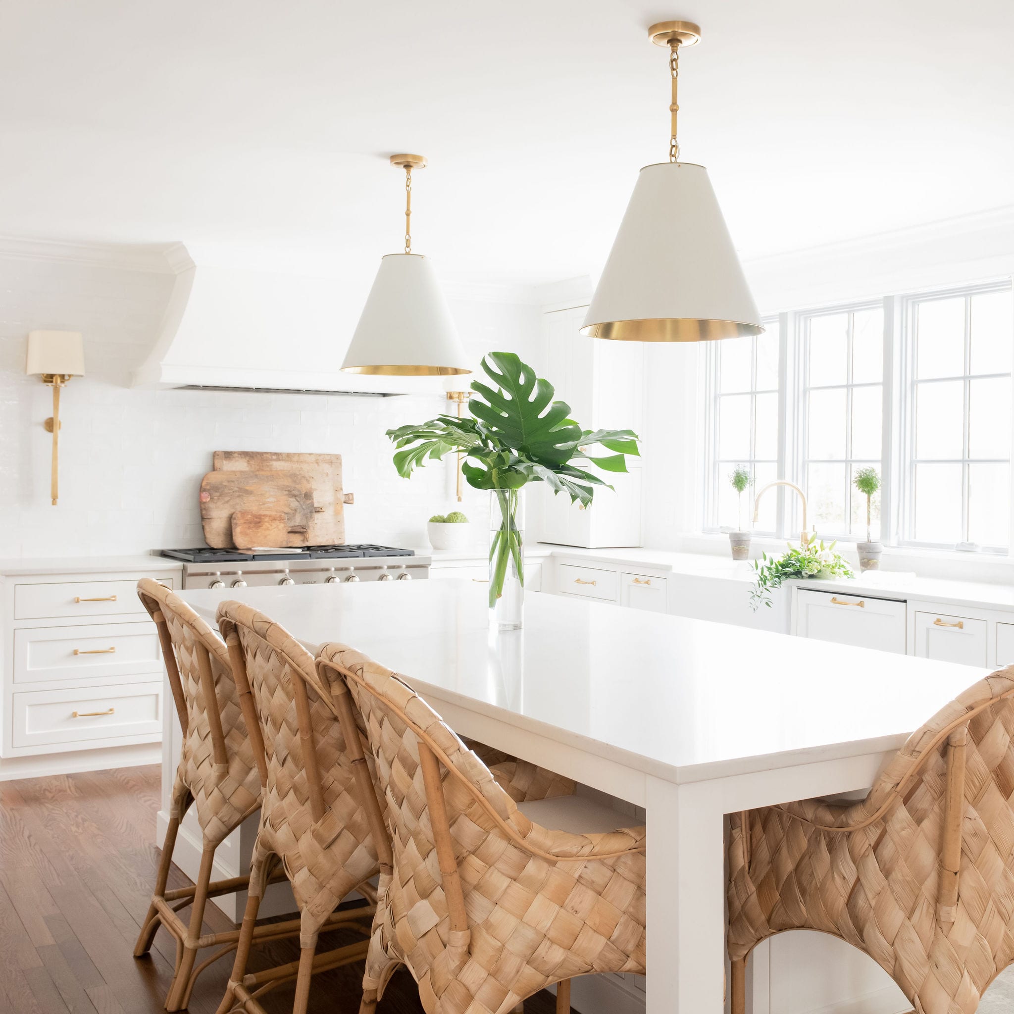
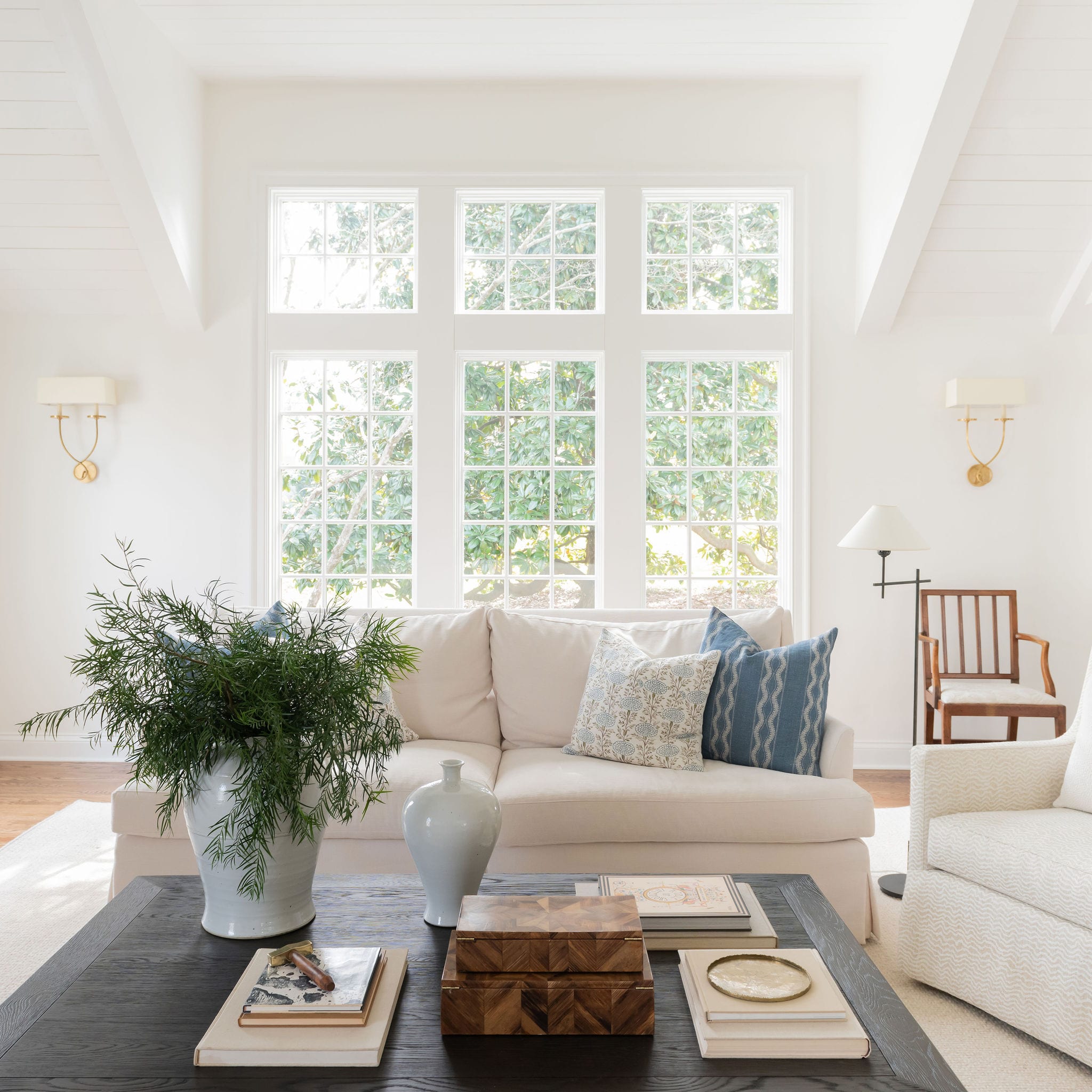
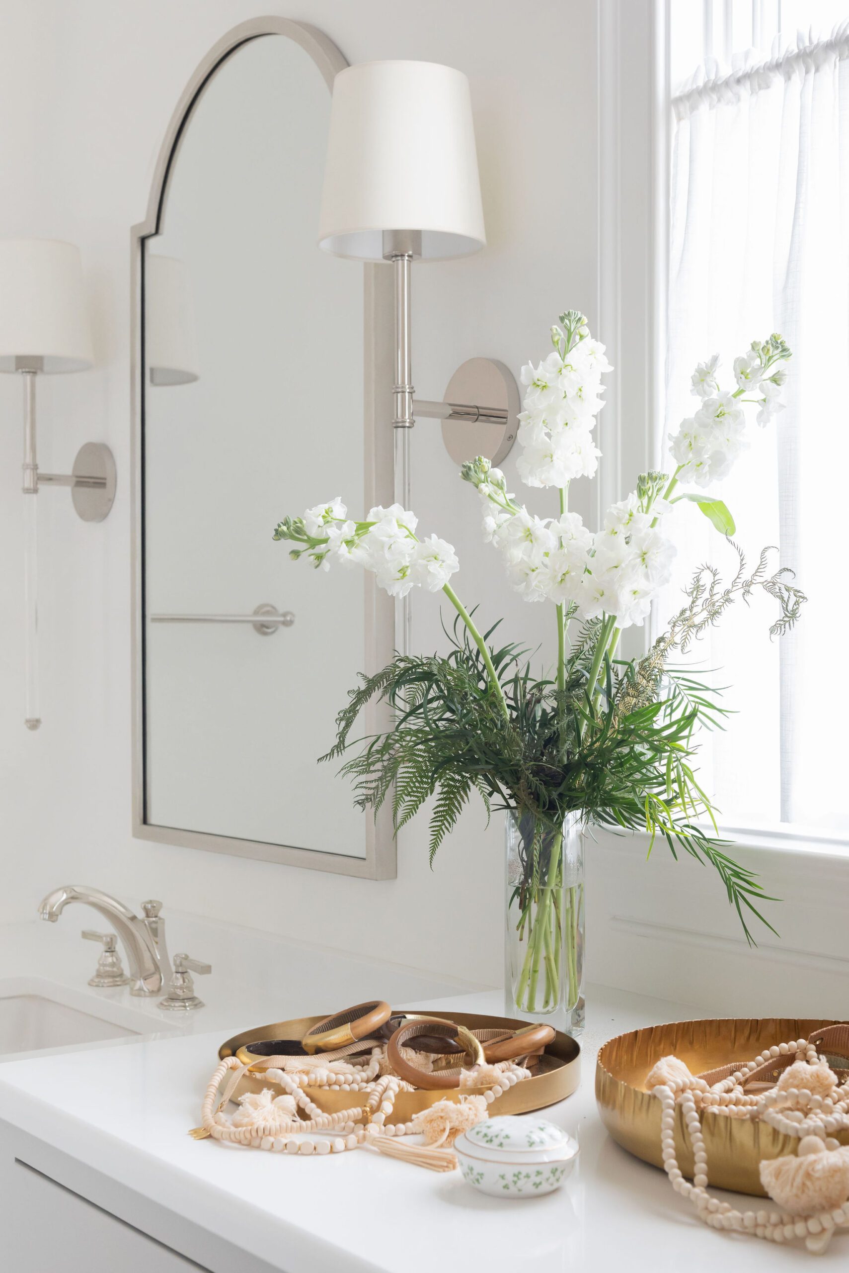
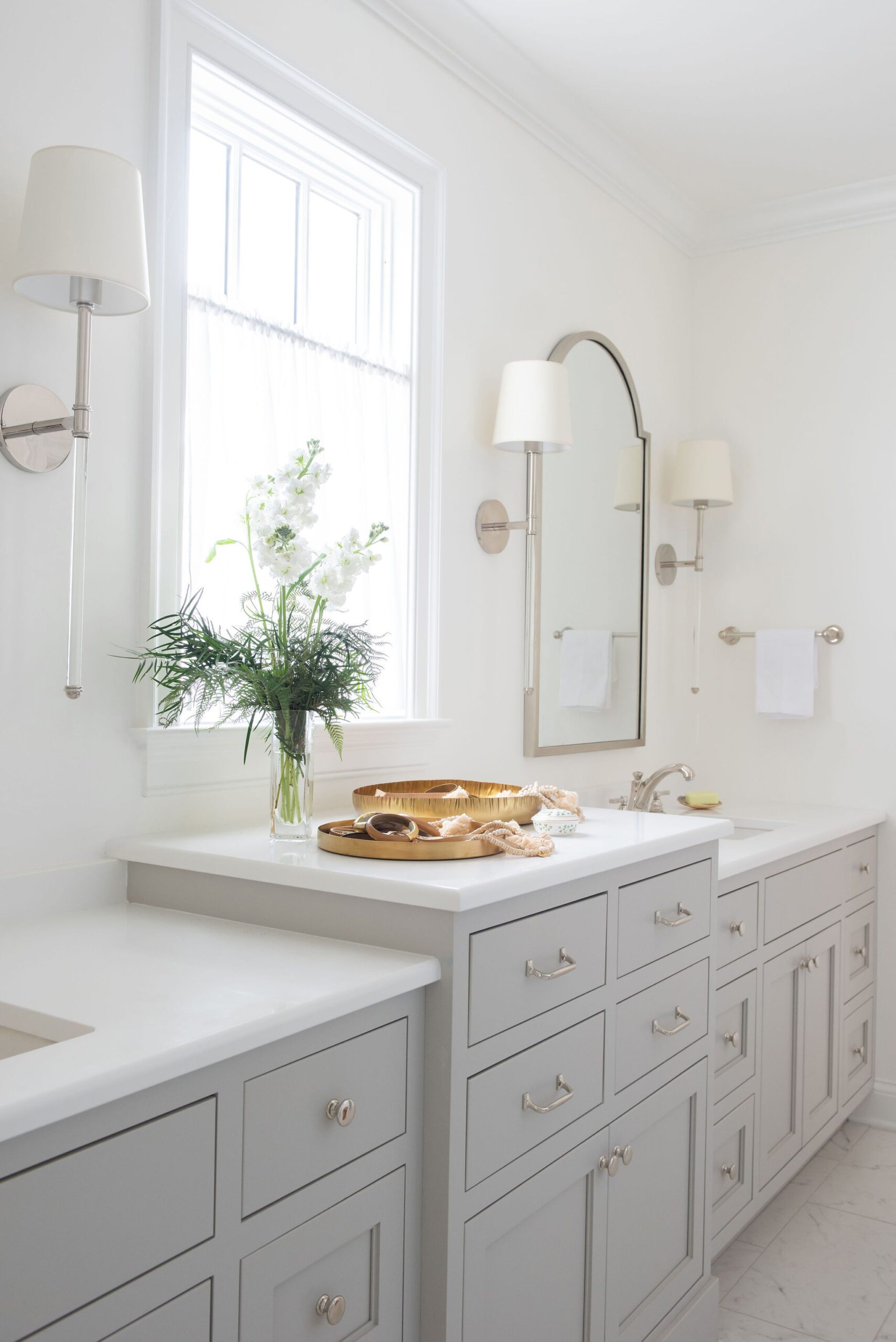
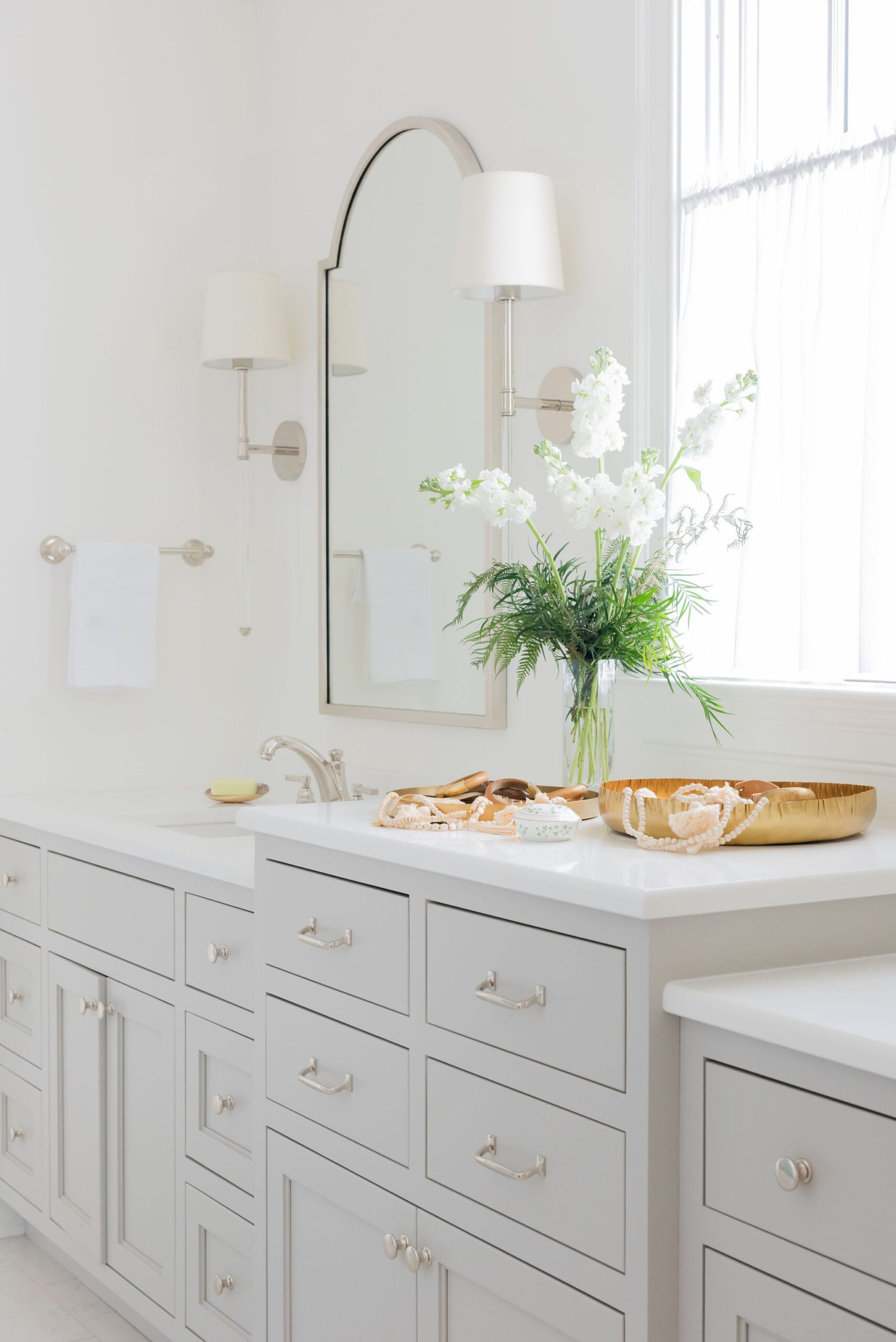
“There are some sconces that I would have never thought to use, but she put those on the wall and it’s almost like a piece of art,” Hillenmeyer says. “And the sconces in the kitchen to the sides of the stove, I would have never thought to do that. But lighting is such a pretty way to decorate a house and just adds to the feel of the room.”
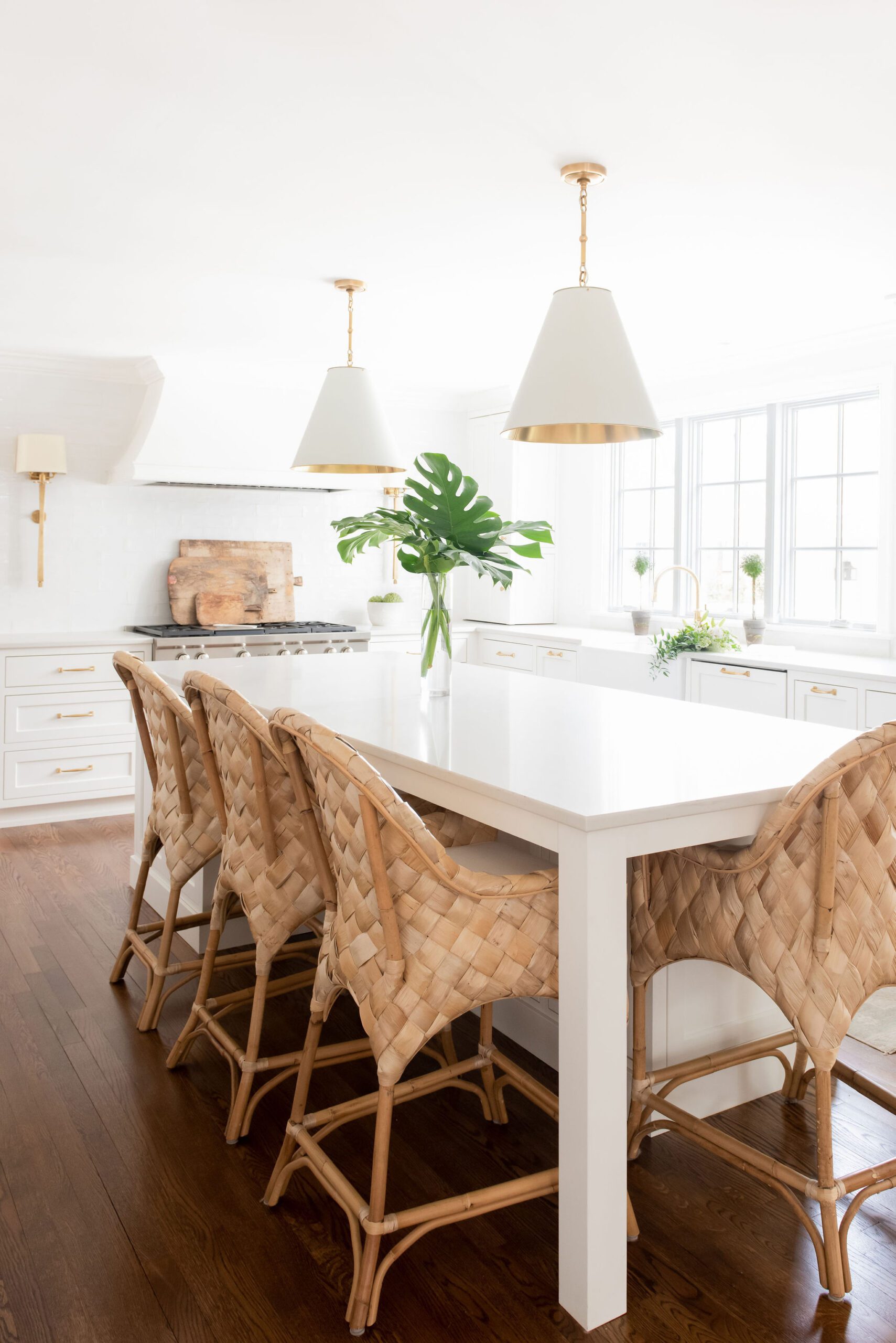
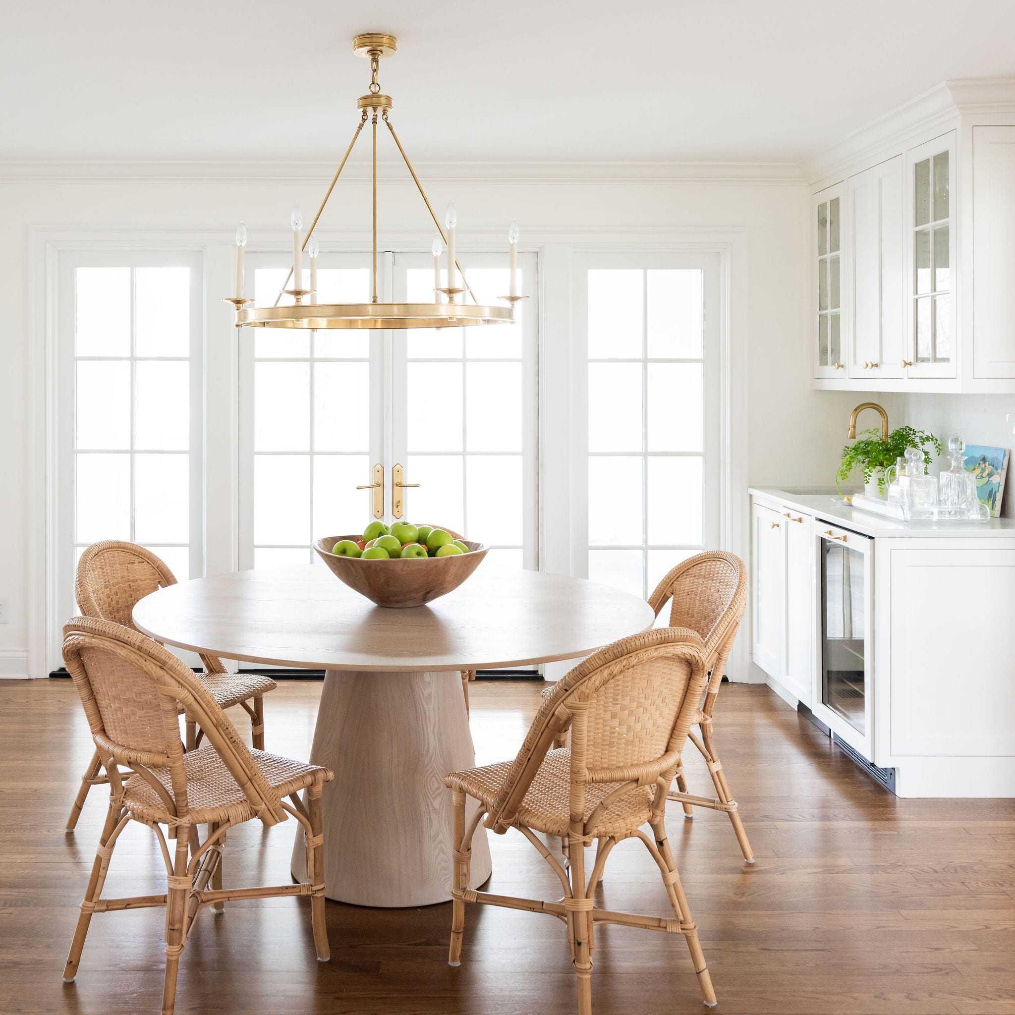
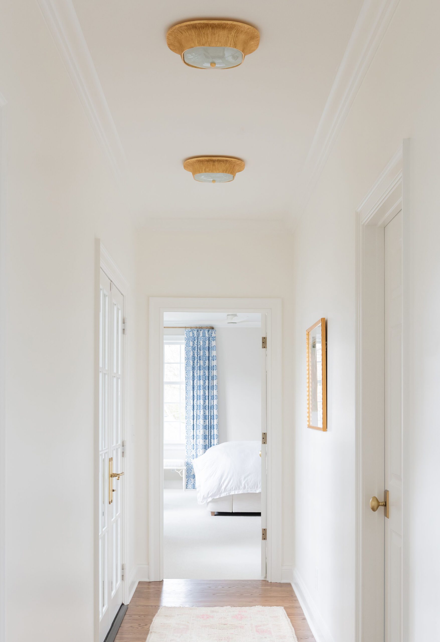
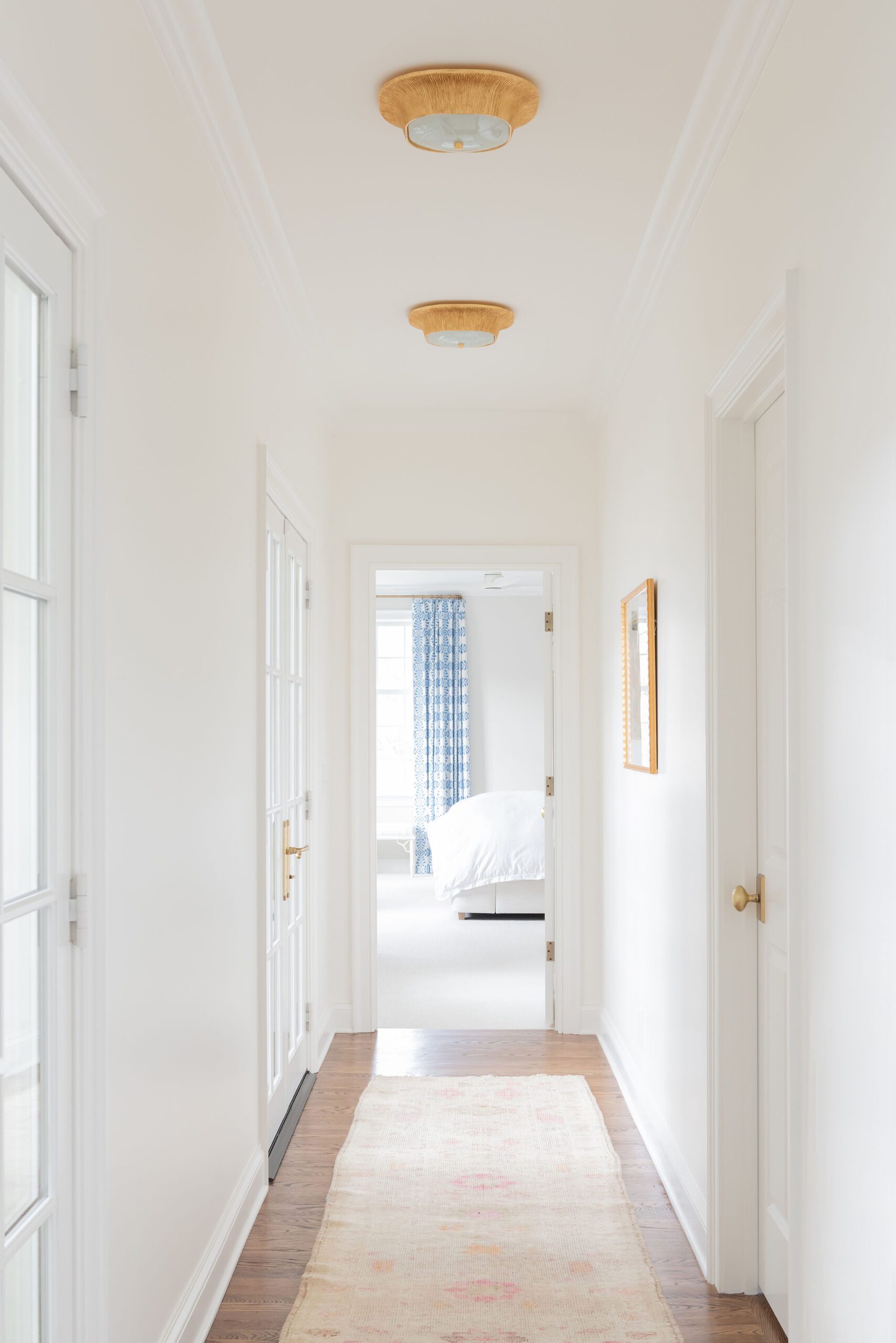
Stanley turned to Circa for most of the lighting, everything from wall sconces for directional light to soft ambient light from chandeliers. She knew Hillenmeyer loved brass, and that Circa’s finishes were exactly in line with the quality she wanted in a forever home.
“Circa served as jumping off point,” Stanley says. “Their brass finishes are just so lovely, and I used that as inspiration to create continuity from room to room, which makes the space feel even larger and grander than it is.”
Working with Stanley and Pogue gave the Hillenmeyers everything they needed to host friends for parties and family in from Louisiana as often as they want.
“They love to entertain,” Stanley says. “Morgan and Leigh are so gracious and always throwing open their doors and hosting dinner parties and having people over. And I just think they didn’t have the space to do that before. They certainly didn’t have anything like that beautiful great room or that incredible porch.”
Now the home they started to grow their family in can continue its job hosting dinners and birthdays and one day, graduations and weddings and baby showers.
“It’s very similar to the feel of the house that they loved when they were 28 years old, but now you walk in the door and there is so much more than the outside reveals,” Stanley says.























Leave A Comment
You must be logged in to post a comment.